
A strong driveway symbol should communicate access, arrival, parking, and home in one clear visual. The best **Driveway Icon Ideas** go beyond a basic strip of pavement. They combine a recognizable driveway shape with a house, garage, gate, border, or landscape feature. This makes the icon useful for property maps, real estate websites, navigation apps, contractor branding, entrance signs, and home improvement graphics. Material and layout also influence the message. Gravel suggests a country property, while geometric concrete suits modern architecture. Curves can feel welcoming, and gates may represent privacy or security. Each concept below presents a complete driveway look that can be simplified into a readable visual symbol. Explore these practical **Driveway Icon Ideas** to find a direction that matches your project.

1. Straight Concrete Driveway Icon
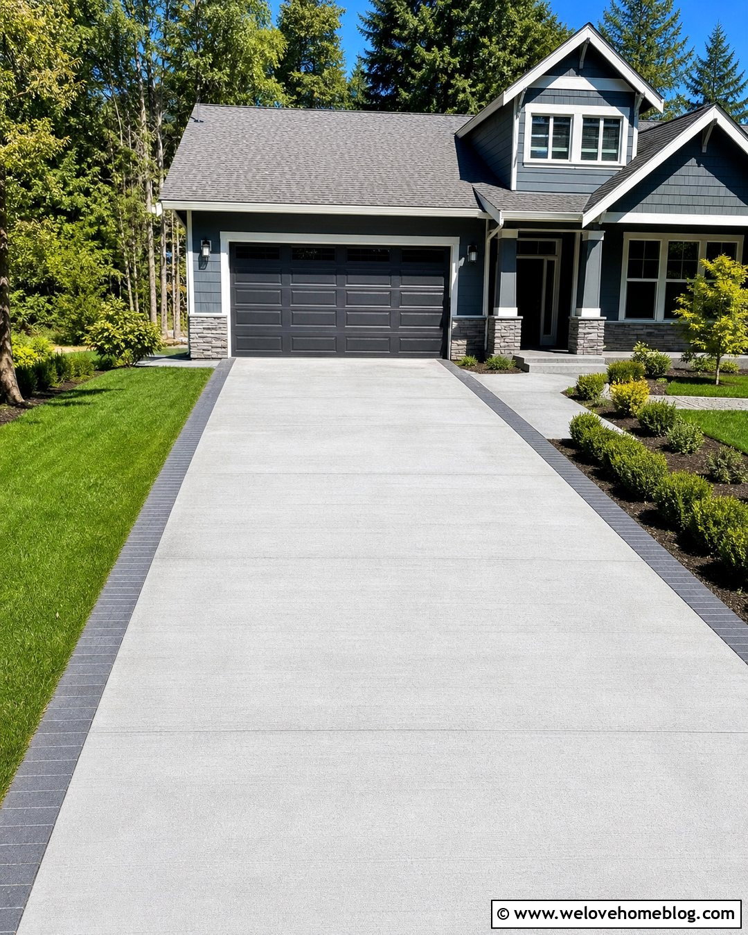
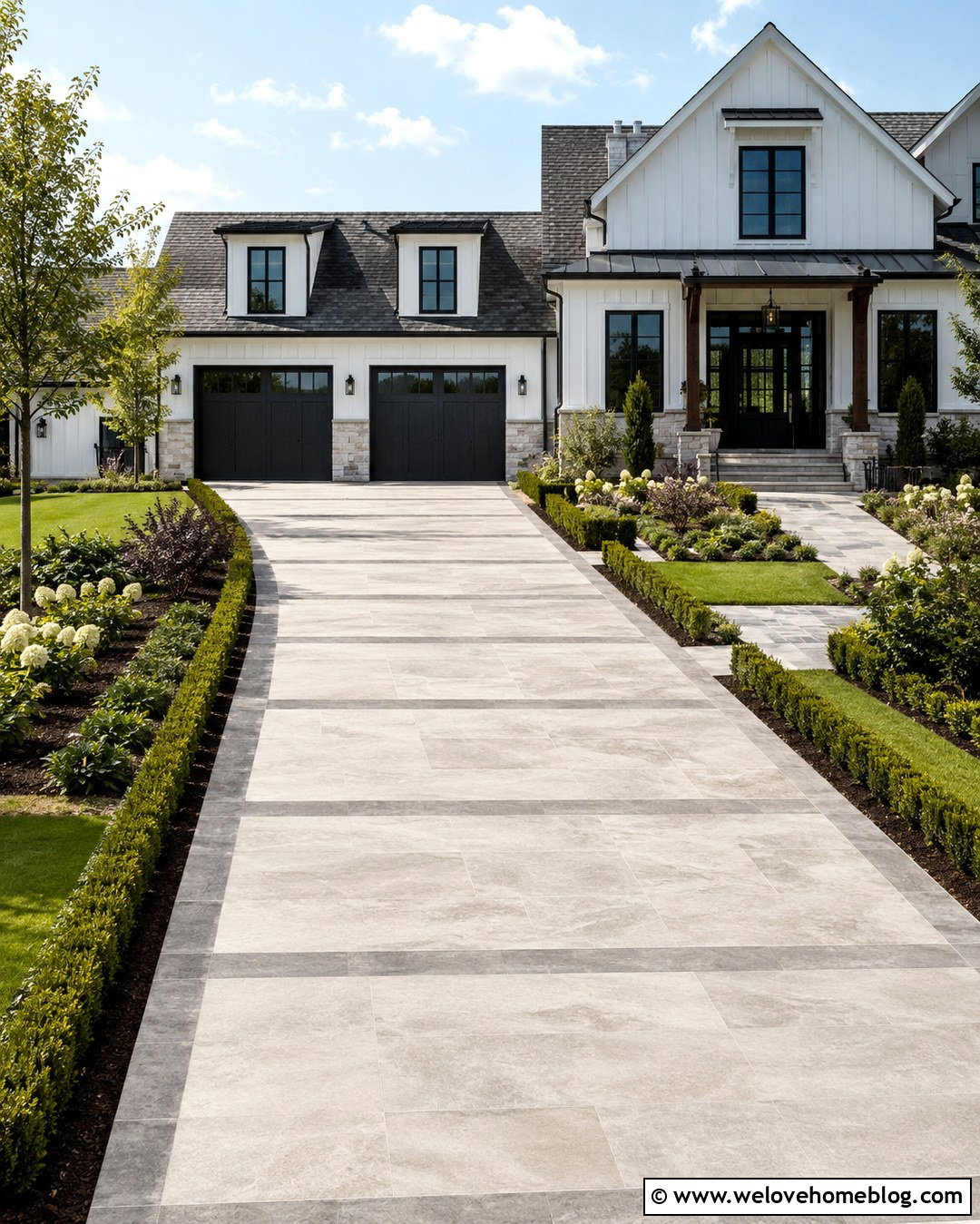
A straight concrete driveway creates one of the clearest and most recognizable icon concepts. Show two clean edges running from the foreground toward a simple garage or house outline. Light gray poured concrete keeps the surface easy to distinguish from the surrounding lawn. Add narrow charcoal paver borders to define the route without making the symbol too busy. Small shrubs near the garage can suggest residential landscaping, while a short walkway connects the driveway to the front entrance. This design works especially well for contractor websites, property plans, and real estate listings. When simplifying the scene, use strong lines and balanced spacing. The driveway should remain the largest visual element so users understand the icon immediately, even at a small size.
2. Curved Gravel Driveway Icon
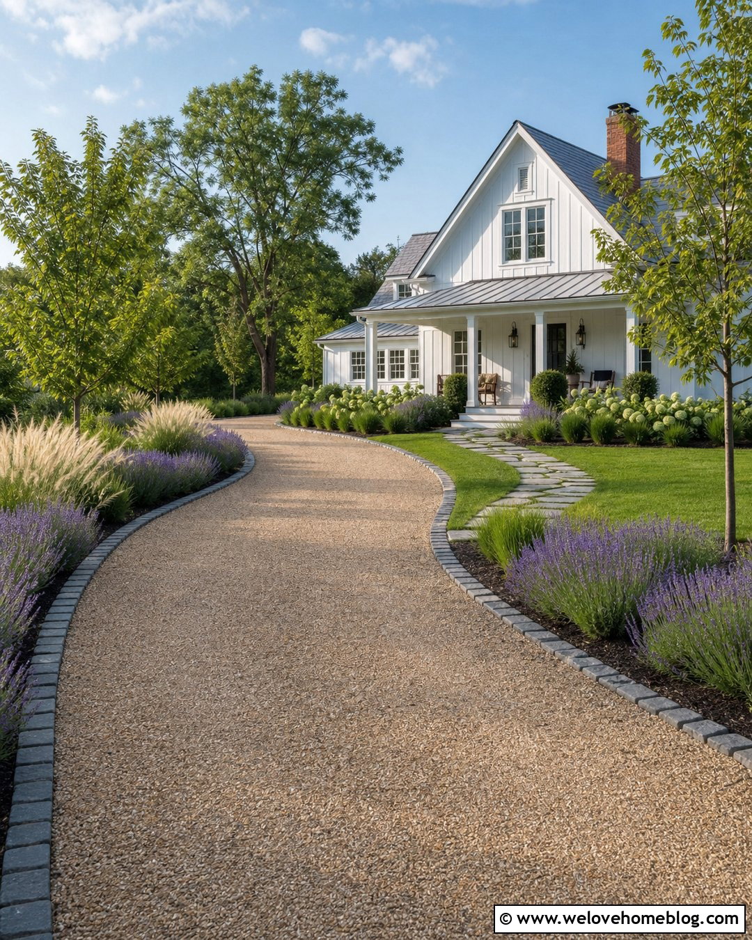
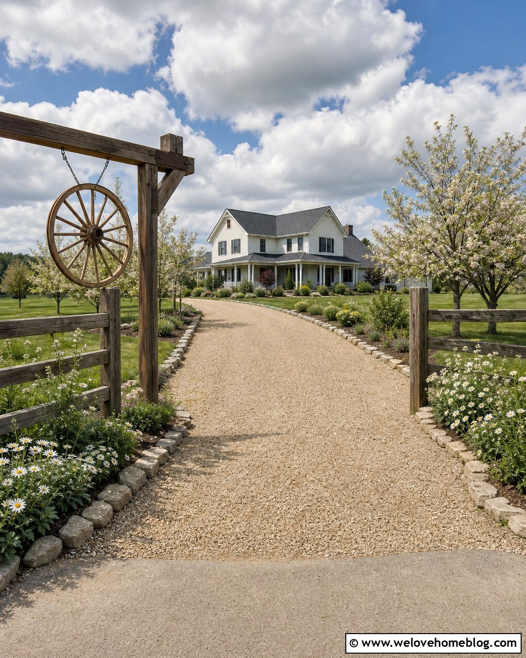
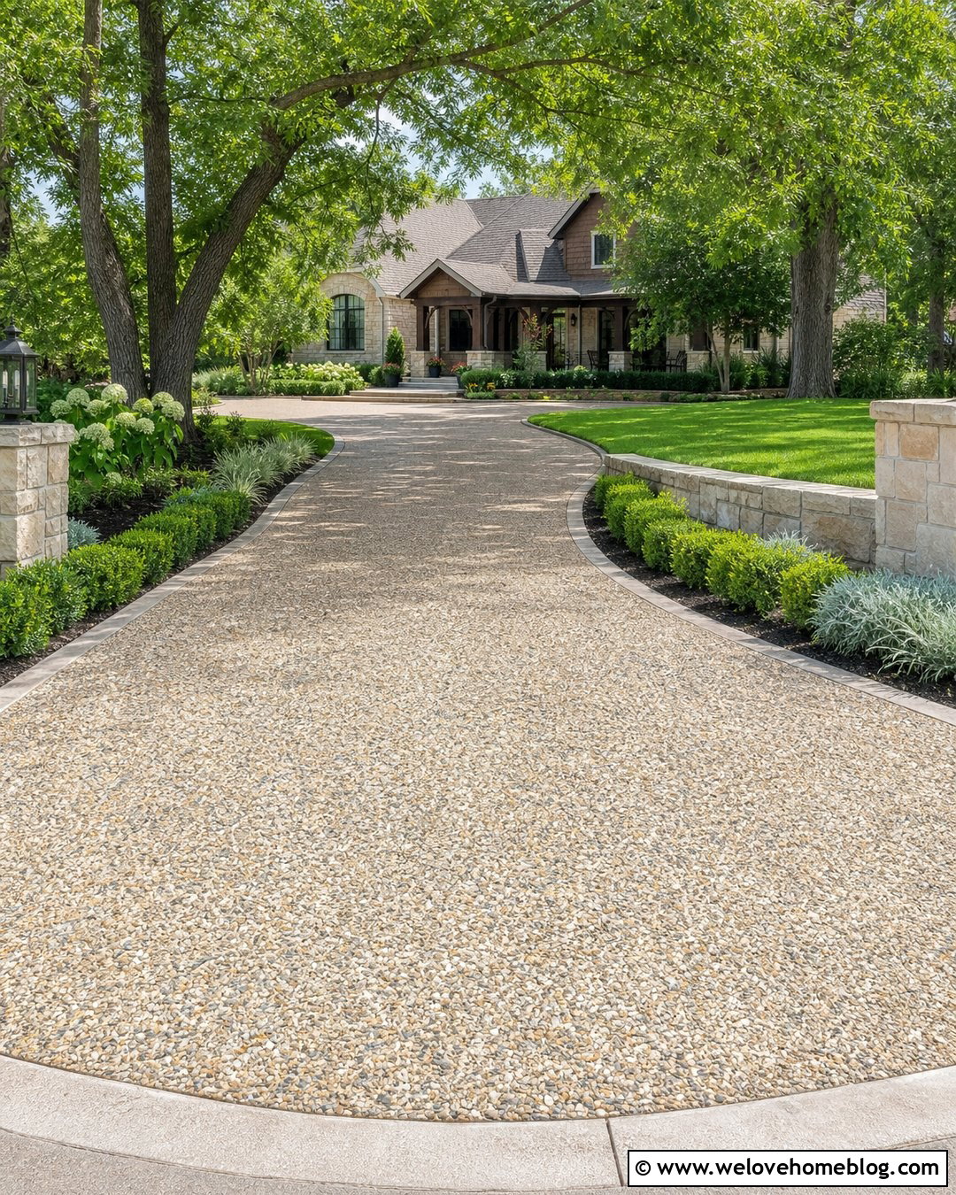
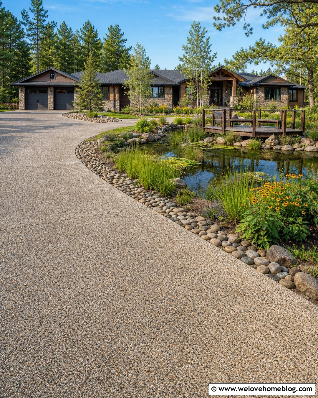
A gentle curve gives a gravel driveway icon a softer and more welcoming appearance. Use warm tan pea gravel arranged in a sweeping route that bends toward a country or farmhouse-style home. Dark cobblestone edging can contain the loose material and create a clear silhouette. Low ornamental grasses, lavender, and a few small trees help explain the curve without hiding it. For the simplified icon, emphasize the S-shaped driveway with a lightly textured fill or a few carefully spaced gravel dots. Avoid showing individual stones across the entire surface, since excessive detail reduces readability. This complete design is ideal for rural property maps, landscape company branding, vacation rental graphics, and entrance markers. The curving shape also helps distinguish it from a road or ordinary walkway.
3. Circular Paver Driveway Icon
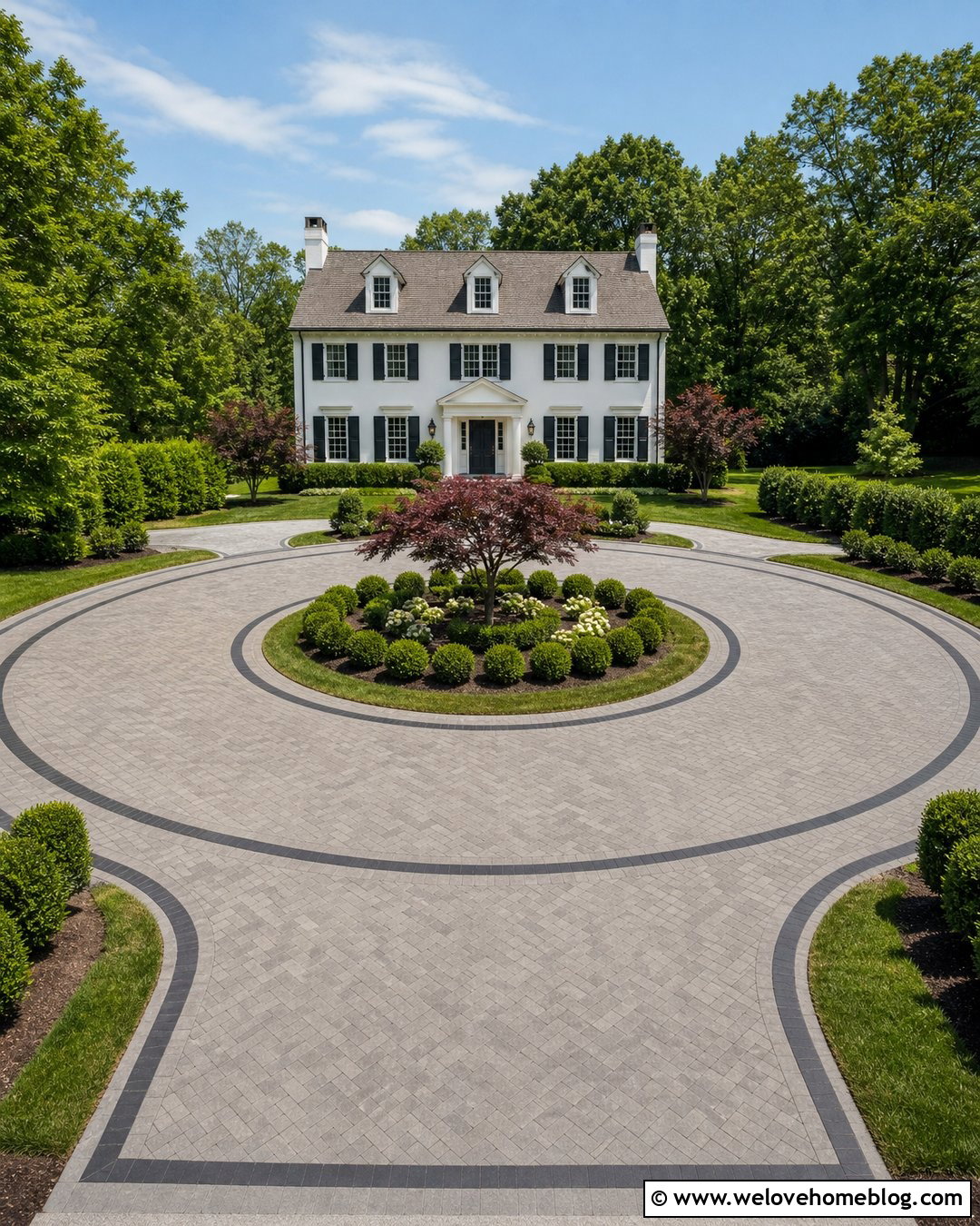
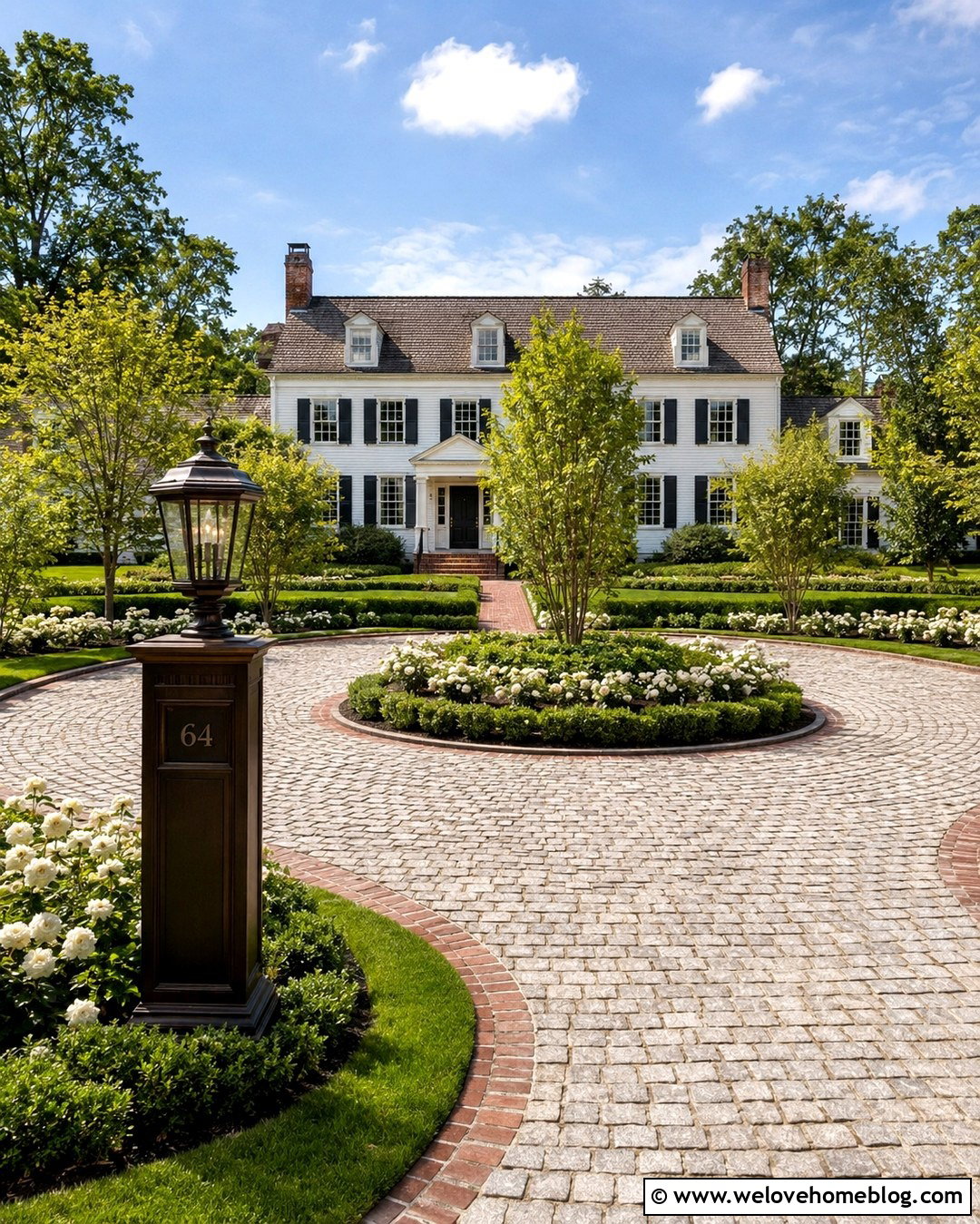
A circular paver driveway makes a distinctive symbol for larger homes and estate properties. The icon can show an oval or round driving loop surrounding a central landscaped island. Use muted gray concrete pavers in a running-bond pattern, with a darker paver ribbon marking both edges. Place a small tree, clipped shrubs, or a simple fountain shape in the center. A symmetrical colonial house in the background completes the residential context. Keep the driveway loop wide and visually open so it does not resemble a decorative wreath. In a small icon, reduce the paver pattern to a few controlled lines rather than drawing every joint. This driveway icon can represent guest arrival, valet access, luxury real estate, or a convenient vehicle turnaround without relying on cars or directional text.
4. Brick Driveway And Garage Icon
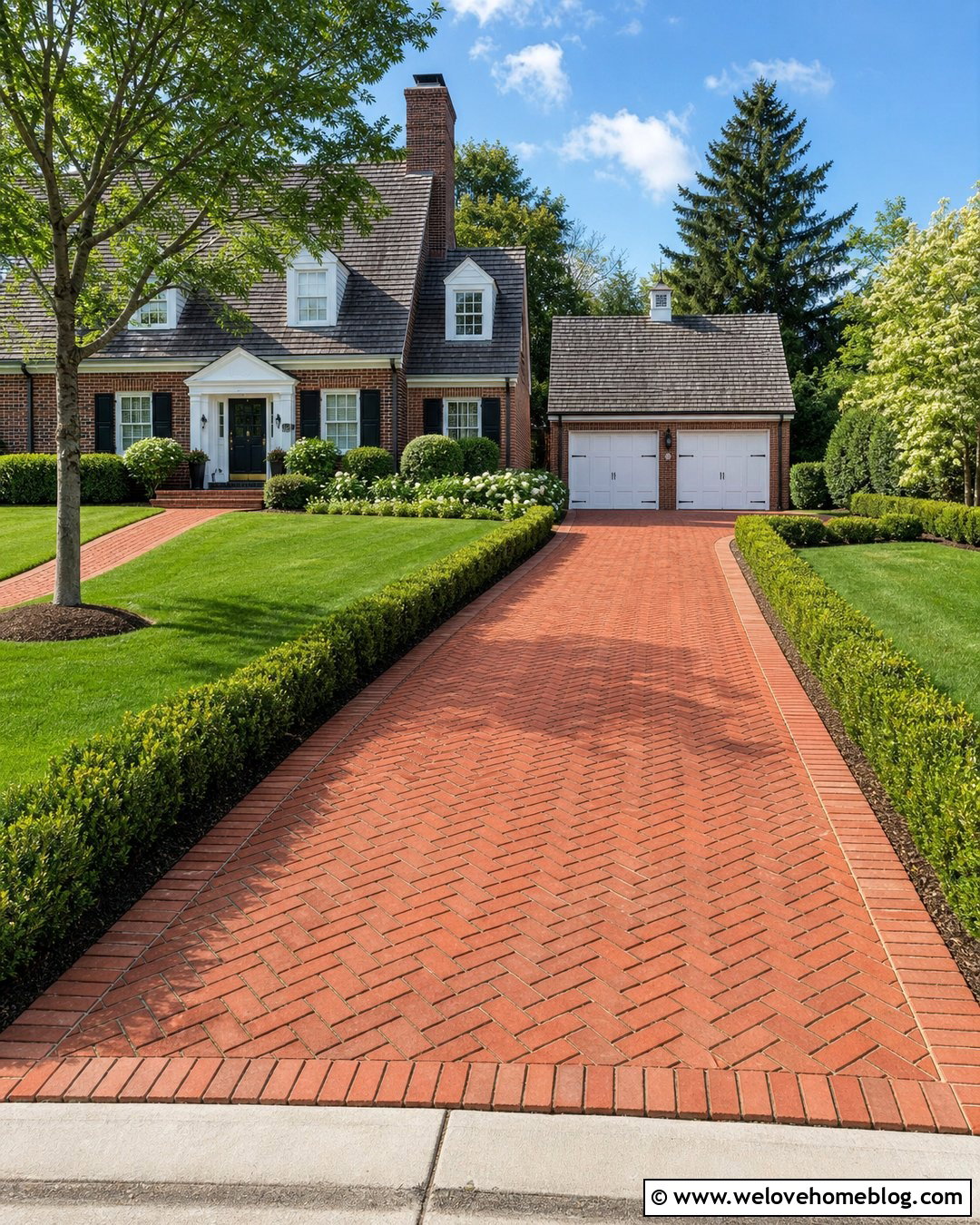
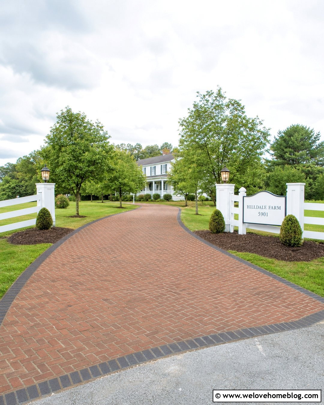
Rich clay brick pavers can give a driveway icon a traditional residential character. Create a straight or slightly flared driveway leading directly to a two-car garage. A simplified herringbone pattern adds texture, while a soldier-course brick border gives the surface a finished edge. Frame the lower driveway with compact boxwoods and a neat green lawn. A brick colonial or Cape Cod house reinforces the classic appearance. For better icon clarity, use deep terracotta for the driveway, cream for the house, and dark brown for outlines. The garage doors should be visible but secondary to the paved approach. This complete design suits masonry businesses, historic property listings, home renovation services, and neighborhood maps. Its strong color contrast remains recognizable in flat, rounded, or colored-outline icon formats.
5. Modern Concrete Strip Driveway Icon
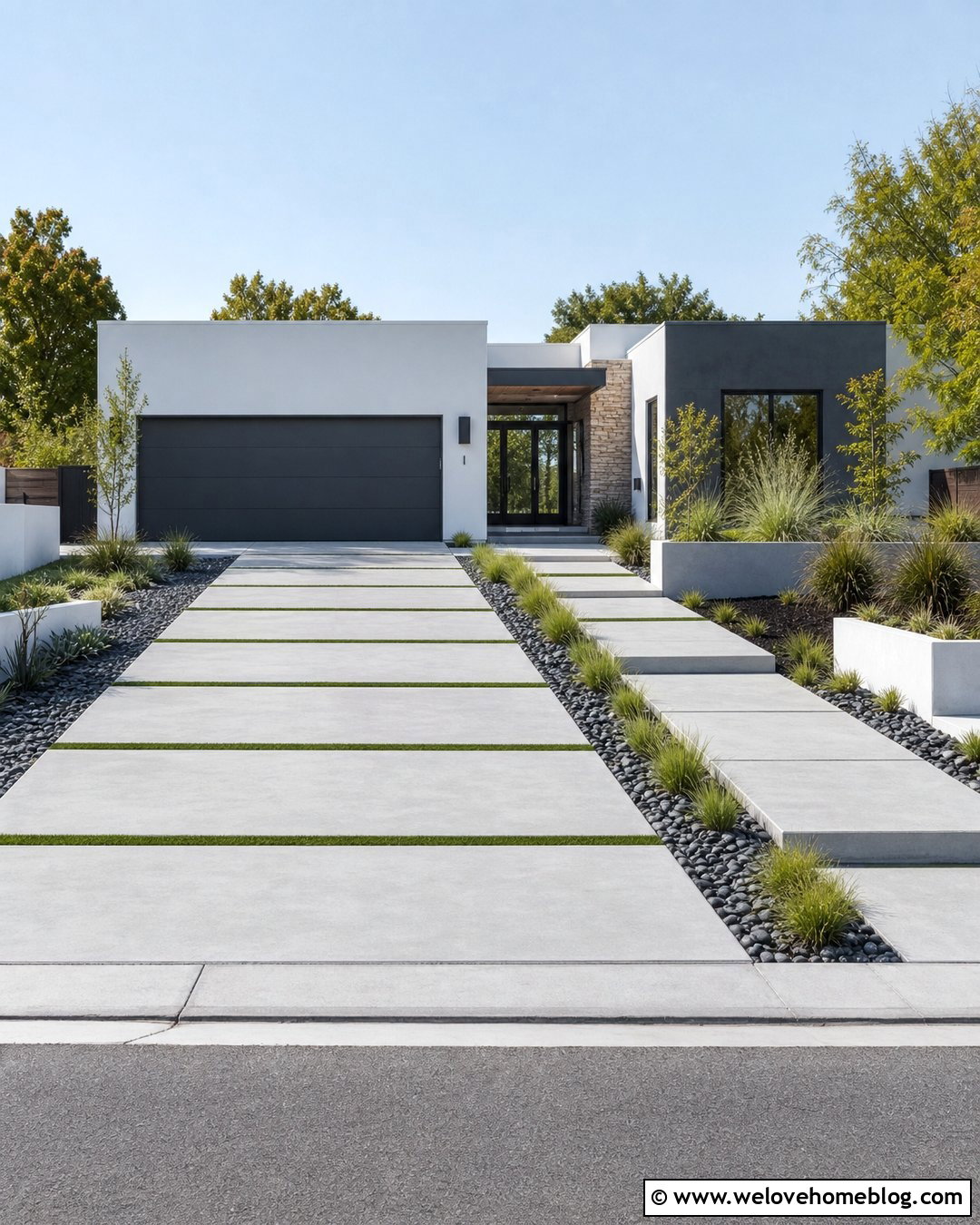
Parallel concrete strips offer a simple driveway icon with a modern architectural feel. Show two or three wide slabs separated by narrow grass or gravel joints. The driveway should run toward a flat-roofed house with clean rectangular forms and a recessed garage. Use pale gray poured concrete, dark river rock borders, and restrained ornamental grasses to maintain the minimalist look. In the icon version, the repeating strips naturally guide the eye toward the house. Keep the grass joints consistent so they do not resemble cracks in damaged pavement. This concept works well for architects, modern home builders, landscape designers, and property development graphics. A limited palette of gray, green, black, and white will keep the symbol crisp. The full layout communicates both driveway access and contemporary curb appeal.
6. Asphalt Driveway With Brick Border Icon
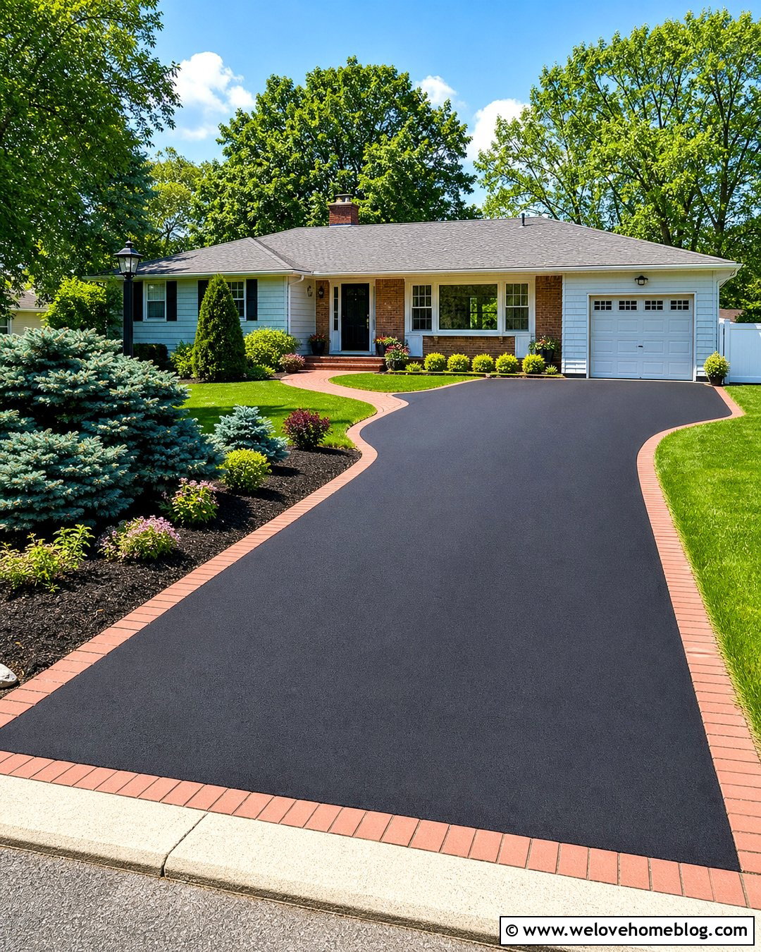
Black asphalt creates a bold central shape that stays visible when a driveway icon is reduced. Use a straight driveway with a slightly widened parking area near a ranch-style house. Red clay brick edging provides warm contrast and clearly separates the asphalt from the lawn. Add a curved planting bed with evergreen shrubs near the garage, plus a short brick walkway leading to the porch. For a flat icon, use solid charcoal for the pavement and a narrow terracotta outline for the border. Avoid heavy asphalt texture, which may make the graphic look grainy. This complete driveway concept is practical for paving contractors, maintenance services, real estate diagrams, and neighborhood signage. The familiar surface and direct garage connection make the icon understandable without labels, arrows, or vehicle illustrations.
7. Cobblestone Estate Driveway Icon
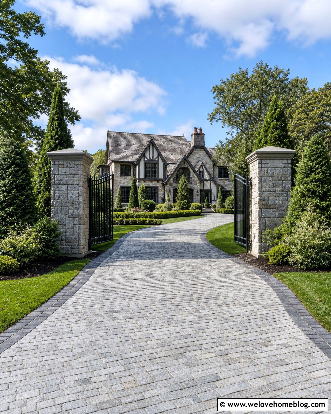
Cobblestone gives a driveway icon an established, high-end appearance. Design a wide, gently curved driveway leading through stone pillars toward a Tudor or European-inspired house. Medium gray granite cobblestones can be suggested with several irregular joint lines rather than hundreds of tiny shapes. Use a darker stone border to strengthen the curve. Layered evergreen shrubs and broad lawns should frame the approach while leaving the entrance open. In a simplified icon, the gate pillars, textured driveway, and peaked roof create three recognizable visual levels. This concept is suitable for estate maps, premium landscape services, luxury property marketing, and historic home graphics. Maintain symmetry at the entrance, but allow the driveway to curve naturally beyond it. That combination gives the small symbol structure, movement, and a clear sense of arrival.
8. Permeable Paver Driveway Icon
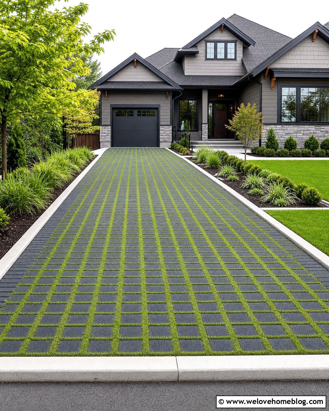
A permeable paver driveway icon can visually represent access and environmentally conscious design. Use charcoal grid pavers filled with short green grass or fine gray gravel. Arrange the surface as a straight driveway leading toward a contemporary craftsman house. A light concrete curb can contain the grid, while rain-friendly planting beds soften both sides. Include sedges, compact shrubs, and a small ornamental tree without covering the paver pattern. For the icon, use a simple repeating grid in only part of the driveway so the design remains readable. Small green squares or joints can communicate the planted openings. This complete look works for sustainable builders, drainage specialists, landscape architects, and green property directories. The driveway should still look durable and vehicle-ready rather than like a lawn or garden path.
9. Resin-Bound Driveway Icon
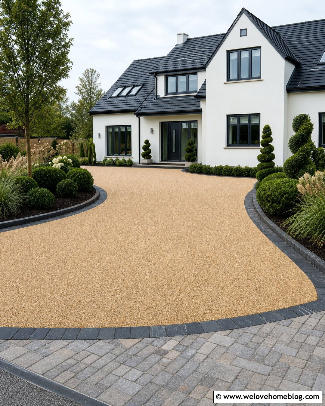
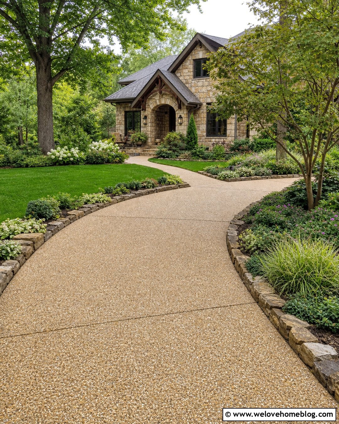
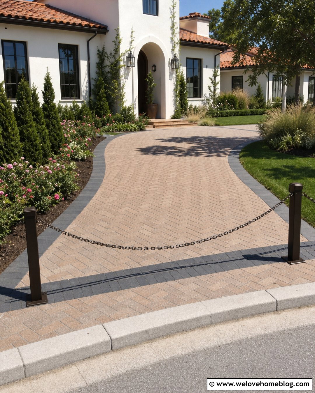
A resin-bound gravel driveway produces a smooth, seamless icon shape with subtle surface character. Show a warm beige resin-bound driveway flowing in a gentle curve toward a white stucco house. Thin charcoal block edging can define the perimeter and coordinate with dark window frames. Use sculpted evergreen shrubs, airy grasses, and a paved front walkway to create a polished residential setting. In the icon, represent the resin finish with a solid warm fill and only a few fine speckles. The curve and contrasting border will communicate the design more effectively than detailed aggregate. This driveway icon is a useful choice for surfacing companies, modern property brochures, landscape plans, and exterior design collections. Its clean outline also adapts easily to flat, gradient, dual-tone, or rounded graphic treatments.
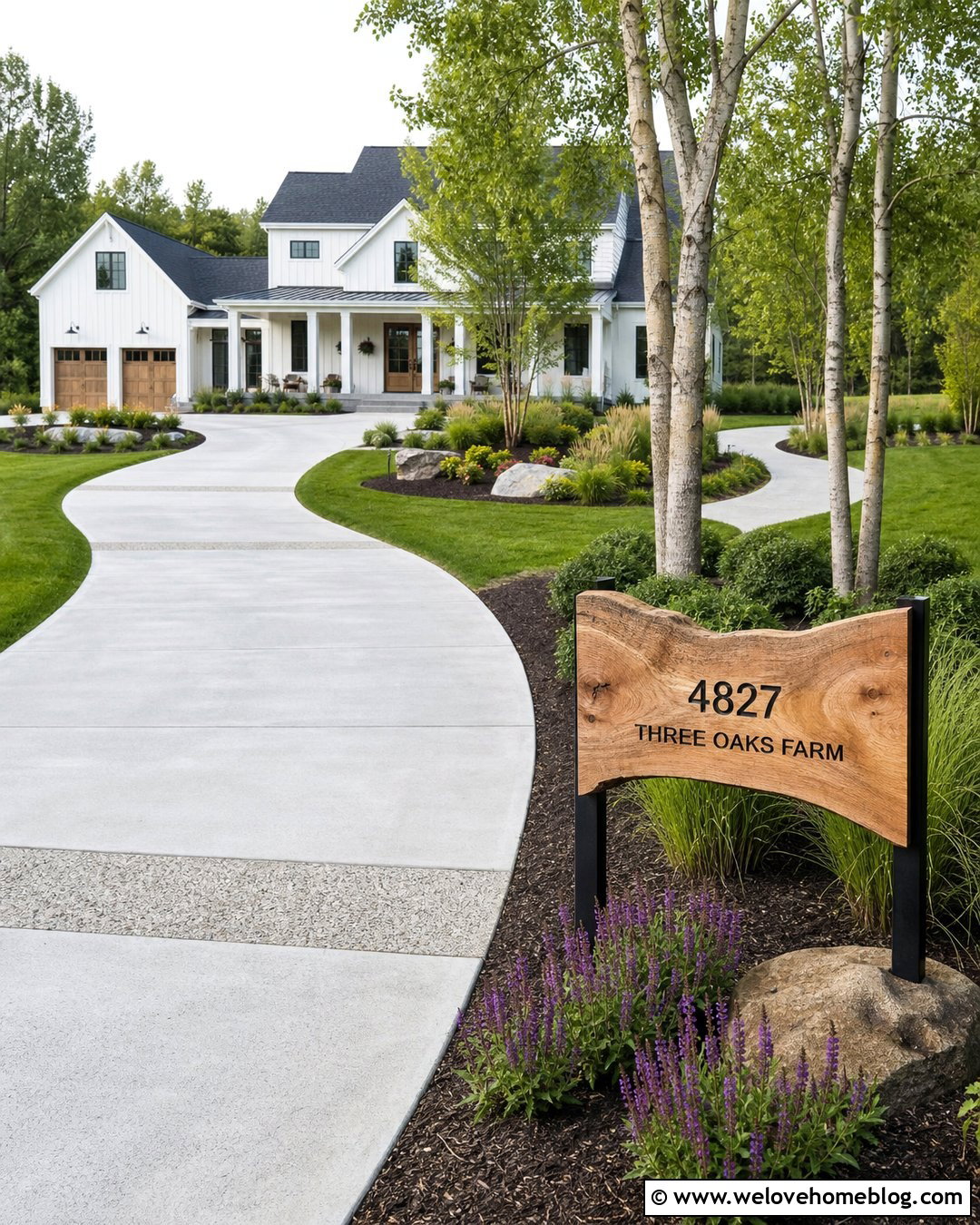
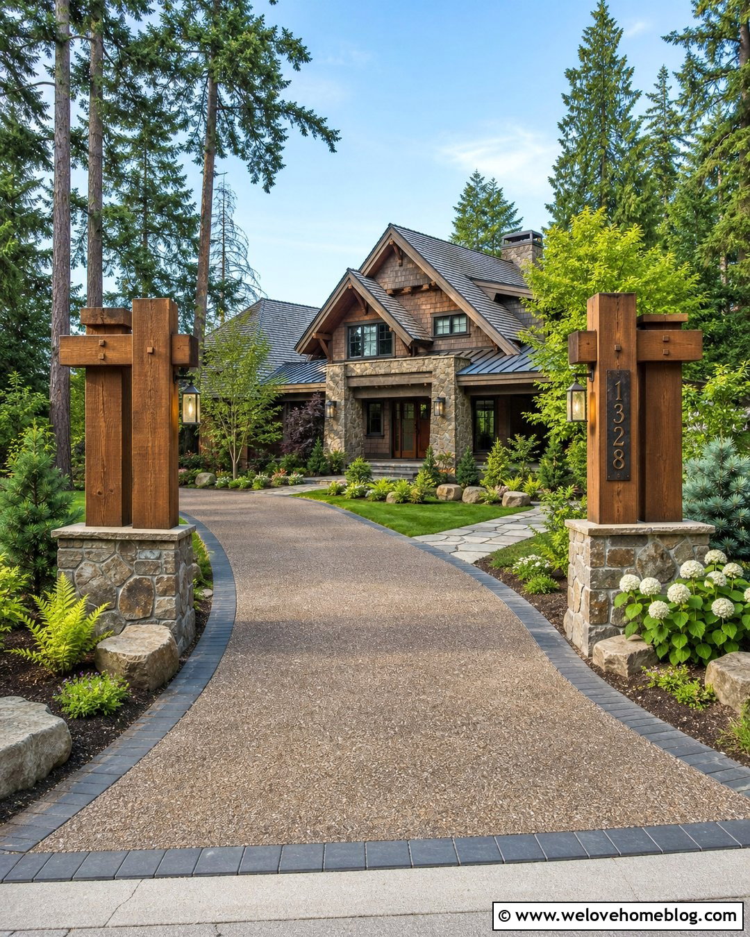
10. Farmhouse Gravel Driveway Icon
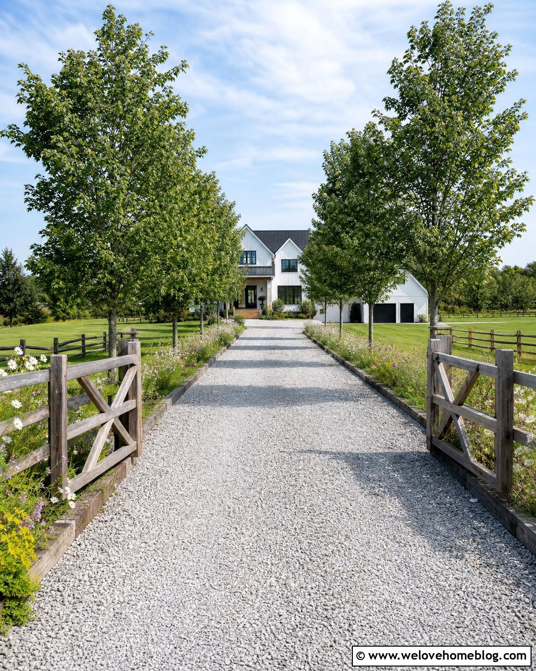
A farmhouse gravel driveway icon should feel practical, open, and easy to recognize. Use light gray crushed stone in a long straight layout that leads toward a modern farmhouse with white siding and a dark roof. Reclaimed timber edging can hold the gravel beside informal grass and wildflower borders. Add a simple wooden gate near the road and a few evenly spaced shade trees farther along the approach. When translating this scene into an icon, prioritize the long gravel path, farmhouse roofline, and gate posts. Use only light stippling to suggest the crushed stone. This complete design works well for rural rental listings, farm maps, country contractors, and agricultural property signs. Wide negative space around the driveway will prevent the house, trees, and entrance gate from competing for attention.
11. Driveway Gate And Pillars Icon
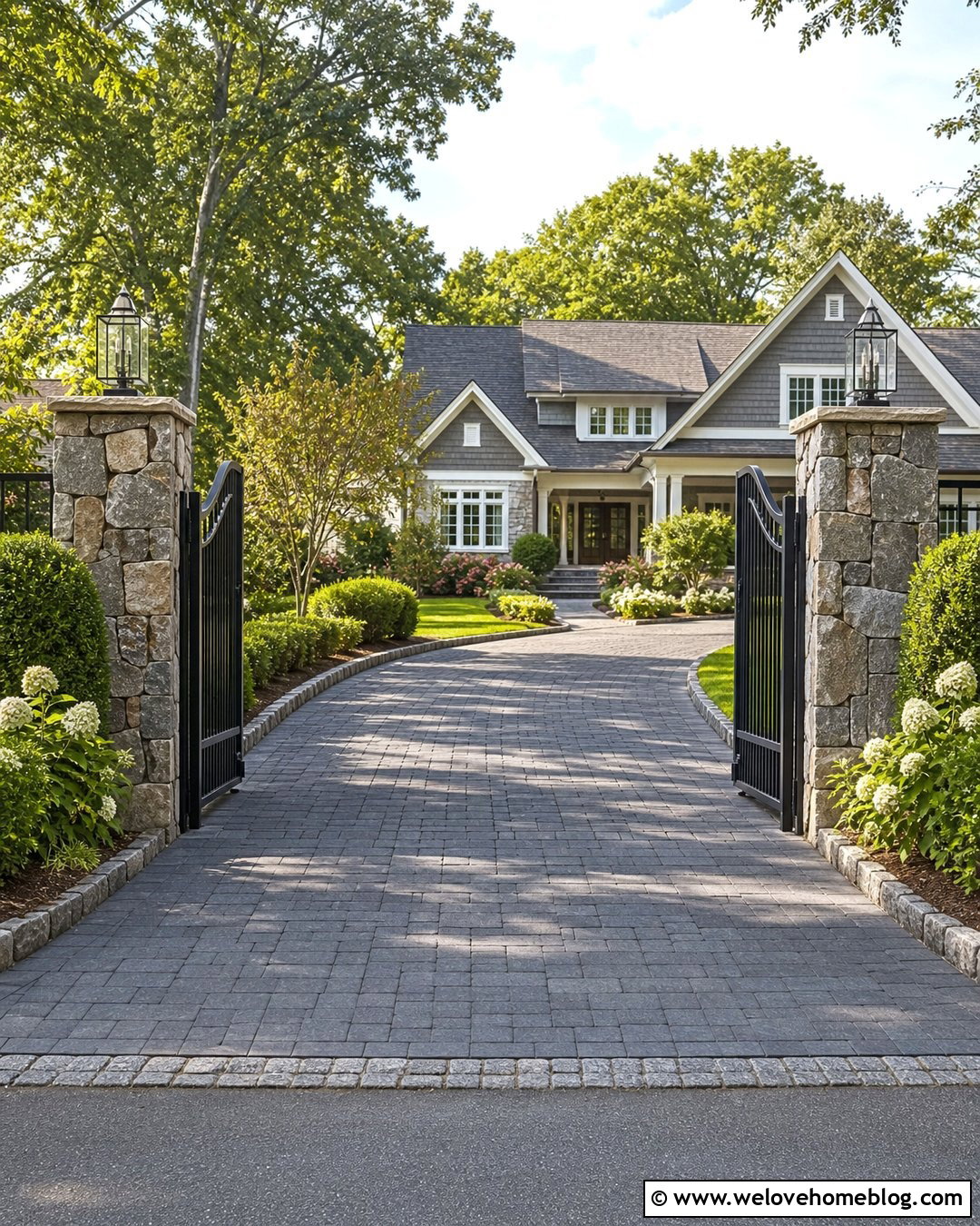
A gate-centered driveway icon immediately communicates a controlled or private entrance. Start with a dark gray interlocking paver driveway that passes between two substantial stone pillars. A simple black metal swing gate can sit open enough to reveal the driveway leading toward a traditional craftsman home. Match the driveway border to the pillar stone for visual unity. Low hedges, flowering shrubs, and a clean lawn should frame the entrance without hiding the gate. In a compact icon, reduce the metalwork to a few horizontal and vertical lines. Keep the pillars bold, since they anchor the design and help distinguish it from a fence symbol. This complete driveway look fits security companies, gated community maps, access controls, luxury property graphics, and custom entrance contractor branding.
12. Tree-Lined Driveway Icon
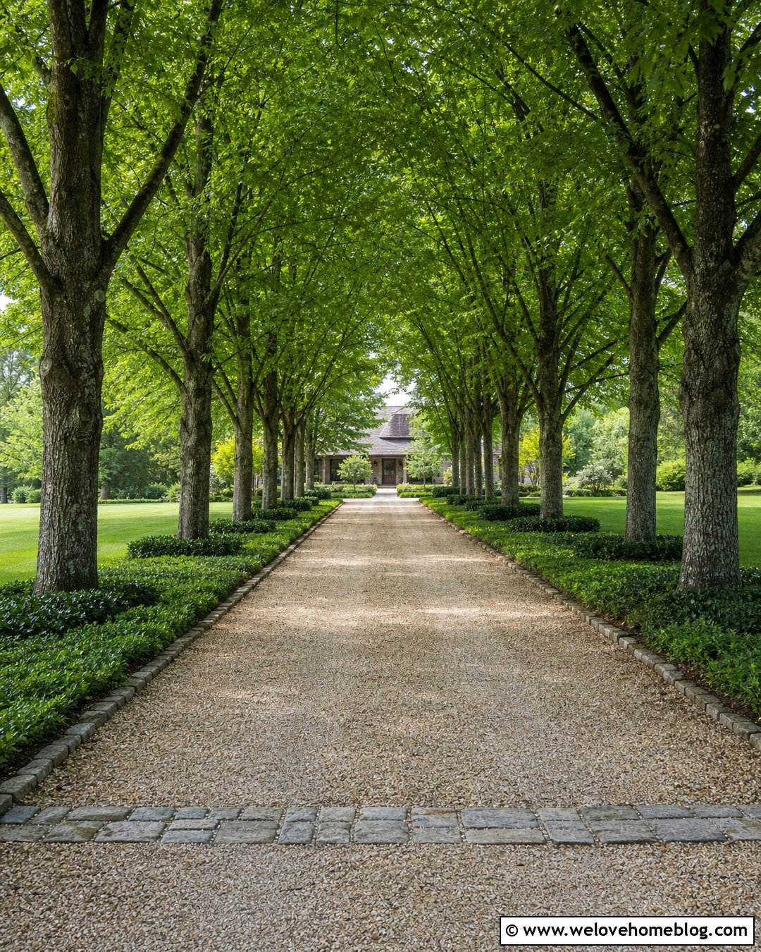
Tall trees can turn a long driveway icon into a strong symbol of direction and arrival. Use a pale tan gravel driveway running straight toward a distant country house. Place evenly spaced deciduous trees along both sides, leaving their lower trunks visible so the driveway edges remain clear. Natural stone bands can mark the entrance and contain the gravel. Underplant the trees with low ground cover rather than tall shrubs. In the simplified icon, create perspective by making the trees and driveway narrower as they approach the house. This complete layout is especially effective for estate directories, wedding venue maps, rural lodging websites, and landscape design graphics. The central vanishing point naturally draws attention inward. Use a restrained green, tan, and dark gray palette to preserve clarity and balance.
13. Small Front Yard Driveway Icon
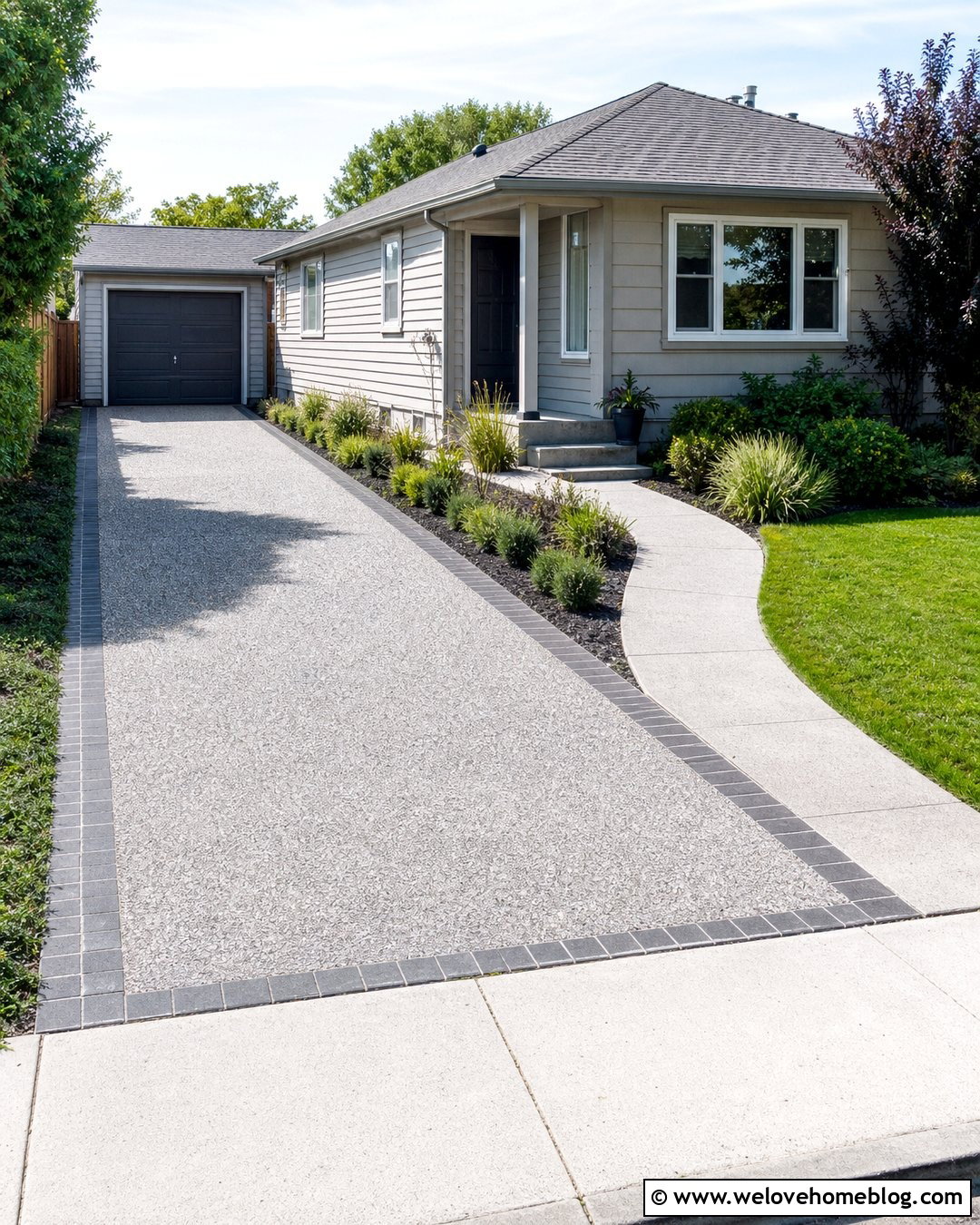
Compact properties need a driveway icon that clearly separates parking, lawn, and the front walkway. Show a narrow exposed aggregate driveway beside a small concrete path leading to a bungalow porch. The driveway can widen slightly near a single-car garage while remaining proportionate to the house. Use dark brick edging to define both paved routes. Add a slim planting bed with low shrubs and ornamental grass between the driveway and walkway when space permits. In icon form, simplify the aggregate to a lightly dotted gray surface and keep the pathway solid. This complete arrangement works for small-home listings, urban landscape plans, remodeling businesses, and residential site diagrams. A curbside perspective will show how the driveway fits into the limited yard without making the composition feel crowded or confusing.
14. Sloped Concrete Driveway Icon
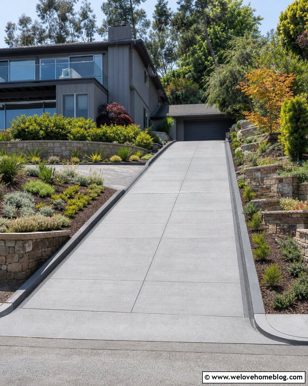
A sloped driveway icon benefits from strong perspective lines and visible grade changes. Use broom-finished gray concrete rising toward a hillside garage or split-level house. Add horizontal control joints that follow the slope and dark concrete curbs along both sides. Terraced planting beds with retaining walls can stabilize the visual composition while showing that the property sits above the street. Choose compact shrubs and ground covers that preserve sightlines near the entrance. In the icon, indicate elevation with two or three stepped landscape lines rather than complicated shading. The driveway must remain wide enough to read as vehicle access. This complete concept can support hillside property listings, engineering diagrams, concrete contractor branding, and construction planning graphics. Clear edges prevent the sloped surface from being mistaken for stairs or a pedestrian ramp.
15. Coastal Shell Driveway Icon
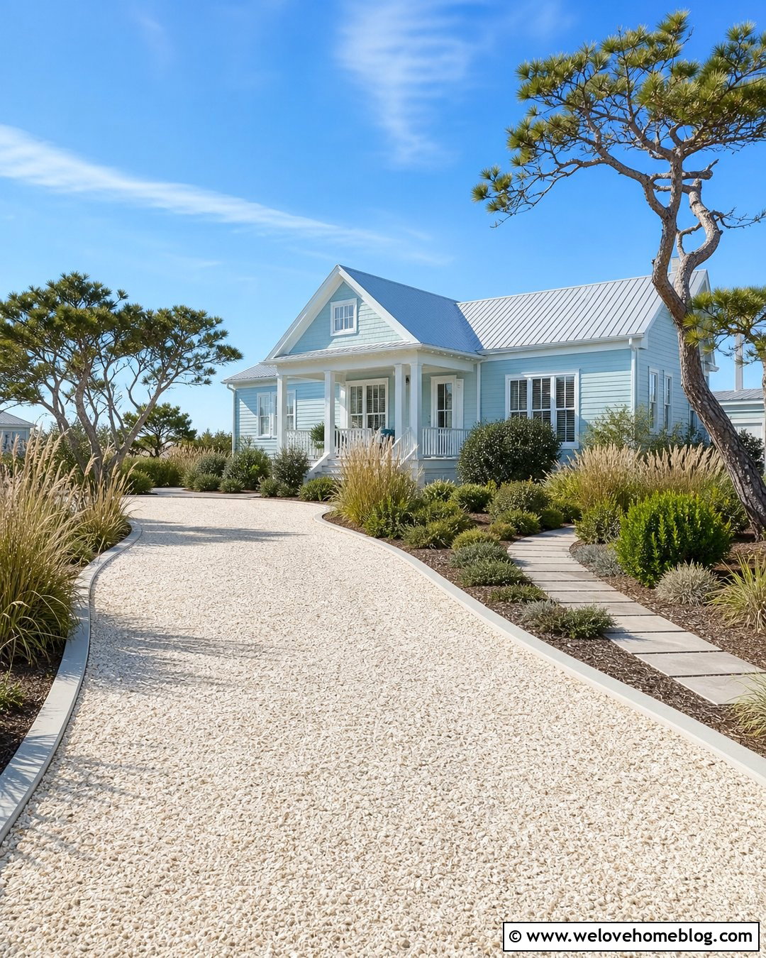
A crushed shell driveway icon offers a bright, regionally inspired alternative to standard gravel. Show an off-white crushed shell surface curving gently toward a coastal cottage with pale blue siding. Light gray concrete edging can contain the shells and create a smooth transition at the street. Frame the driveway with salt-tolerant grasses, rounded shrubs, and a sandy-toned walkway. A few wind-shaped trees can suggest the coastal setting without dominating the design. For the icon, use a creamy driveway fill with sparse shell-like marks and a soft blue house silhouette. This complete look works for beach rental maps, coastal landscapers, vacation property graphics, and local contractor branding. Keep the palette fresh and high contrast so the pale driveway remains visible against the white background commonly used in digital interfaces.
16. Desert Driveway Icon
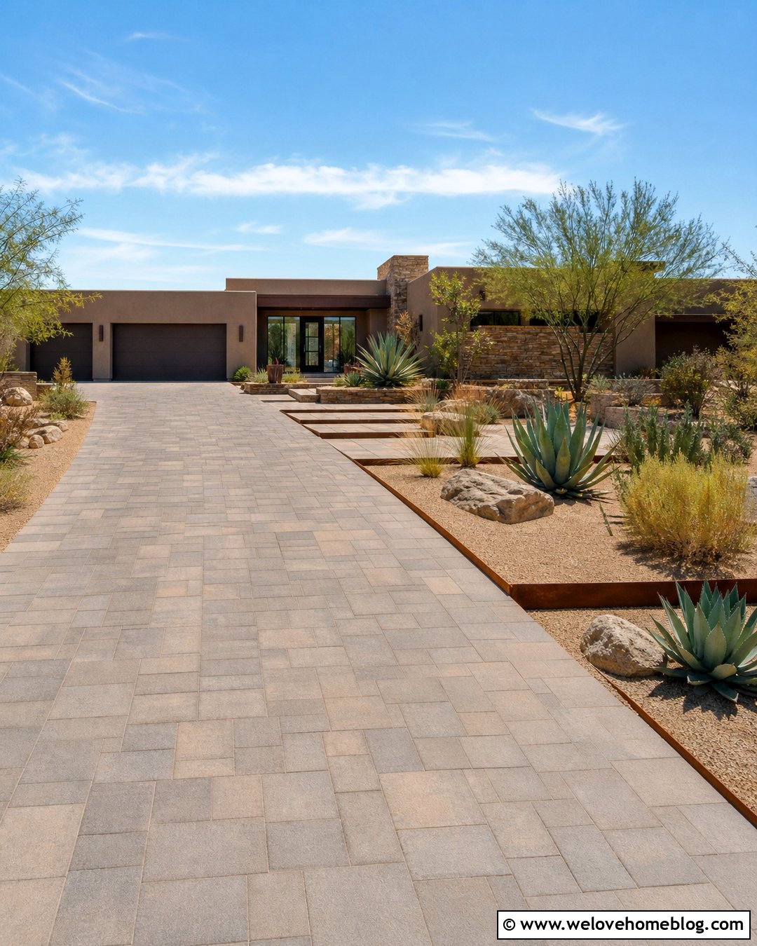
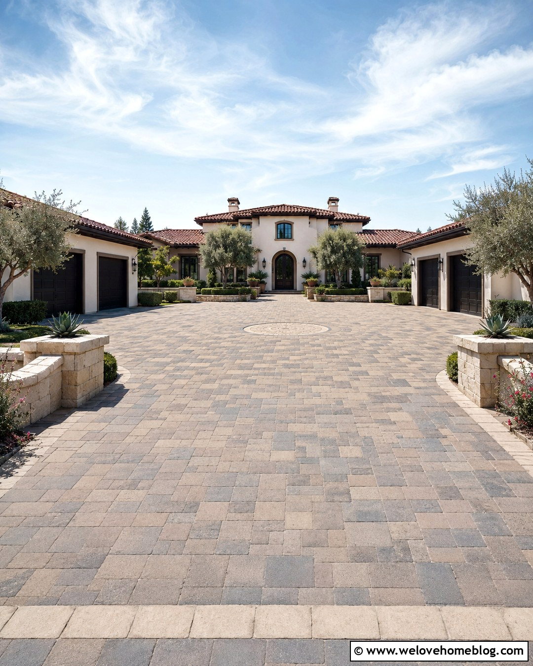
A desert driveway icon can combine a simple paved route with low-water landscaping. Use warm gray concrete pavers in a broad straight layout leading toward a low-profile Southwestern house. Rust-colored steel edging and bands of tan decomposed granite can define the driveway without introducing lush lawn. Arrange sculptural agaves, desert grasses, small boulders, and a few upright accent plants along the sides. The simplified icon should use geometric plant shapes and a limited earth-tone palette. Avoid adding too many spiky details, especially around the driveway edges. This complete design is suited to desert property listings, drought-conscious landscape companies, regional builders, and home exterior collections. The contrast between the orderly pavers and natural gravel beds helps the driveway remain the central, recognizable feature of the icon.
17. Snow Country Asphalt Driveway Icon
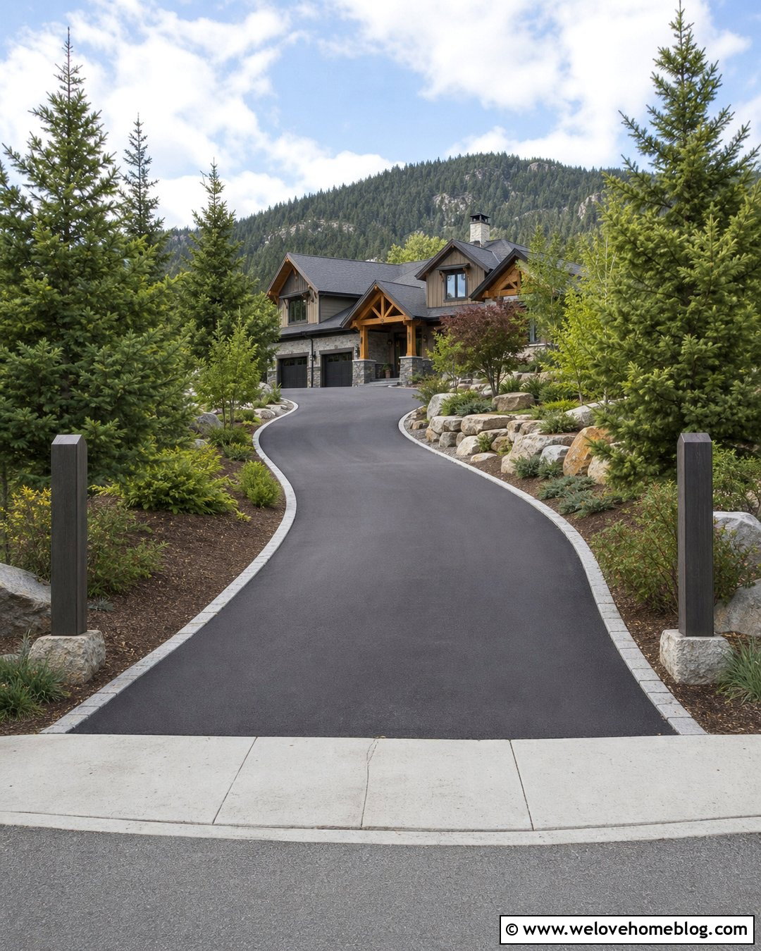
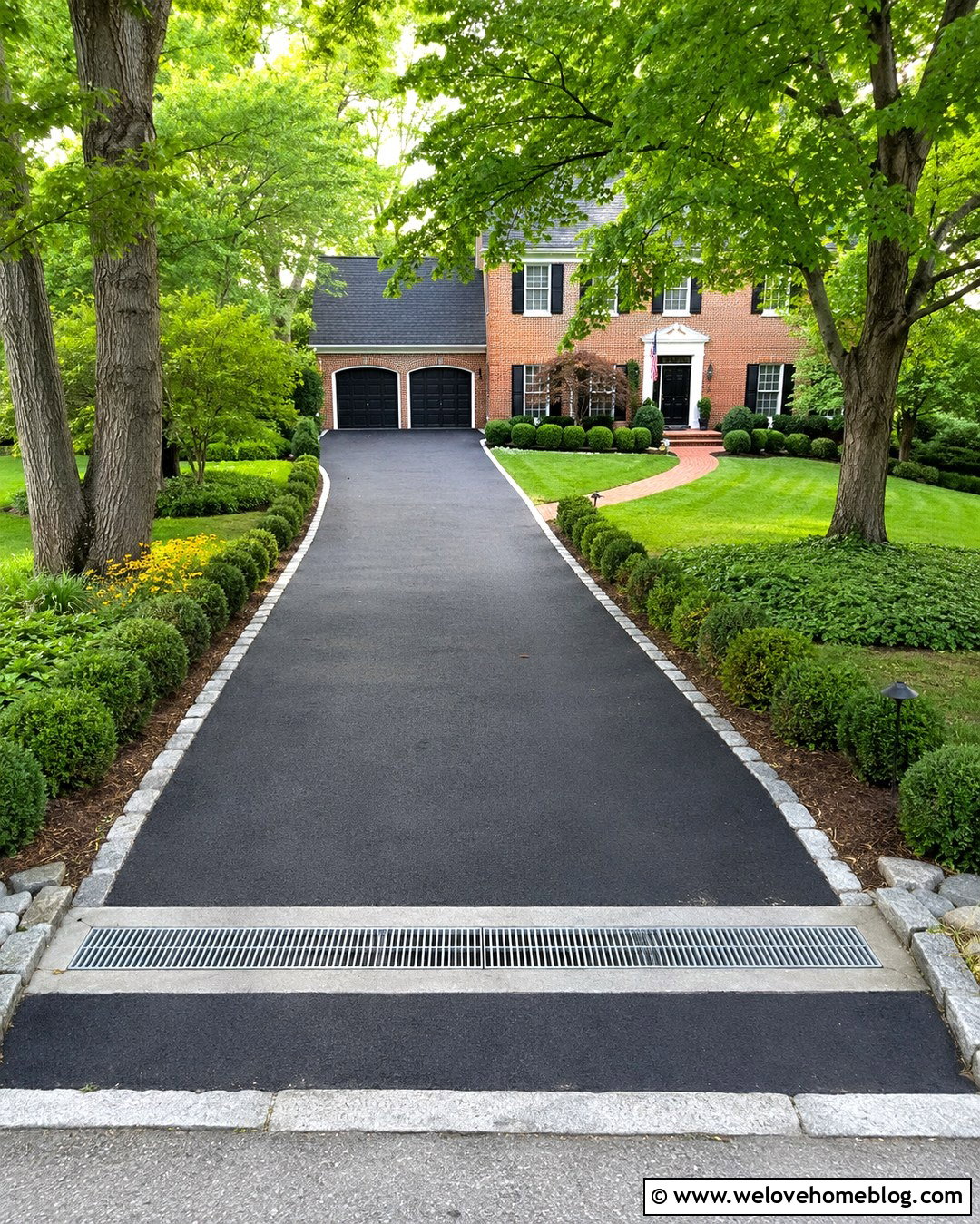
A snow-country driveway icon should emphasize a durable surface and clearly marked boundaries. Use smooth black asphalt in a gently curved layout leading to a mountain craftsman or cabin-style home. Place granite curbs along the lower driveway and tall marker posts near the edges. Evergreen trees and low stone planting beds can frame the route without making it narrow. A light gray drainage apron at the street adds a practical transition. When simplifying this scene, use dark pavement against white or pale surroundings for immediate contrast. Small evergreen triangles can communicate the setting without requiring snowflakes or seasonal decoration. This complete driveway icon works for mountain rental maps, snow removal services, paving contractors, and rural navigation graphics. Keep the driveway path open and uninterrupted so its direction remains unmistakable.
18. Split Driveway Icon
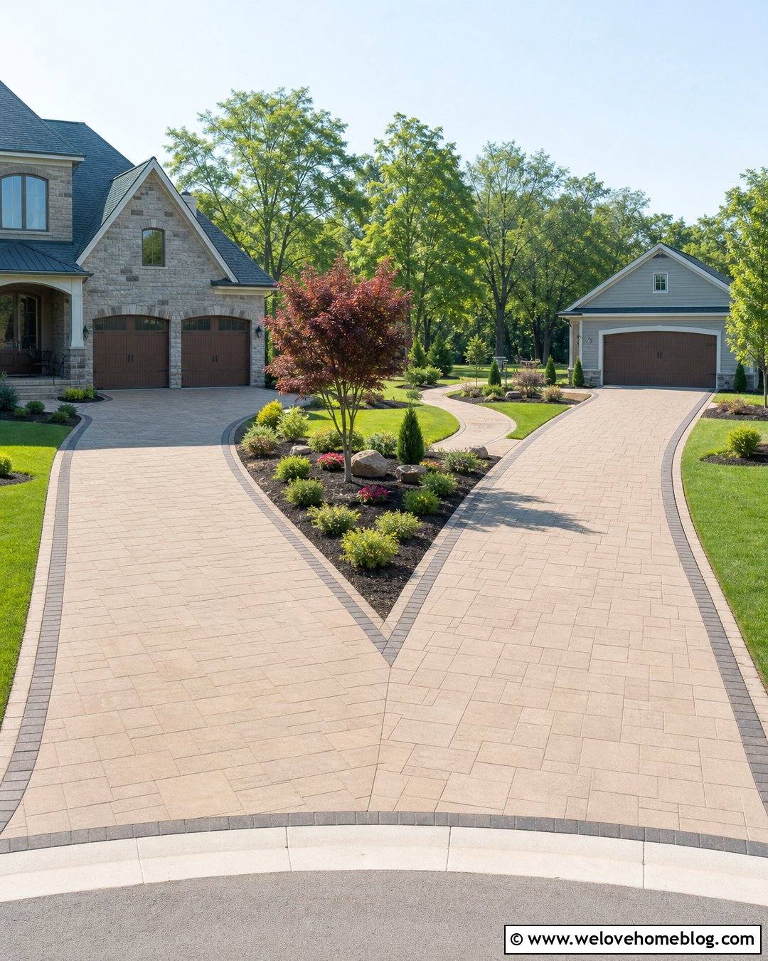
A split driveway icon communicates multiple destinations within one property. Begin with a tan concrete paver entrance that divides into two clean branches. One branch can lead toward an attached garage, while the second curves to a side parking pad or detached workshop. Use a dark paver ribbon around every edge to make the fork easy to follow. A central triangular planting bed with a small ornamental tree can separate the routes. Keep the surrounding lawn and shrubs simple. In the graphic version, exaggerate the split slightly so it remains visible at small sizes. This complete layout works for property directories, multi-building sites, guest instructions, home service apps, and larger residential plans. Consistent widths and smooth curves help the symbol look intentional rather than like an intersection or public roadway.
19. Horseshoe Driveway Icon
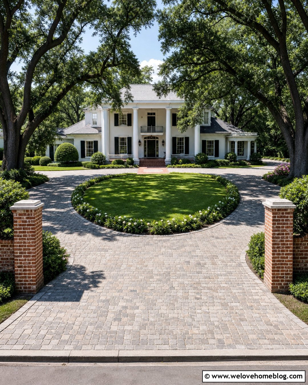
A horseshoe driveway icon provides a clear visual for properties with separate entrance and exit points. Use warm gray cobblestone-style concrete pavers forming a broad U-shaped route in front of a Southern colonial or traditional ranch house. Brick entry columns can mark both openings, while a curved lawn and central garden fill the space between them. Add low flowering borders around the island so the full horseshoe outline remains visible. In a simplified graphic, make the two curb connections bold and keep the central planting area uncluttered. This complete design suits event venues, larger homes, schools, offices, and real estate maps. The continuous U shape should be the main feature. A slightly elevated viewpoint will make the circulation pattern easier to recognize than a low, straight-on perspective.

20. Driveway Address Sign Icon
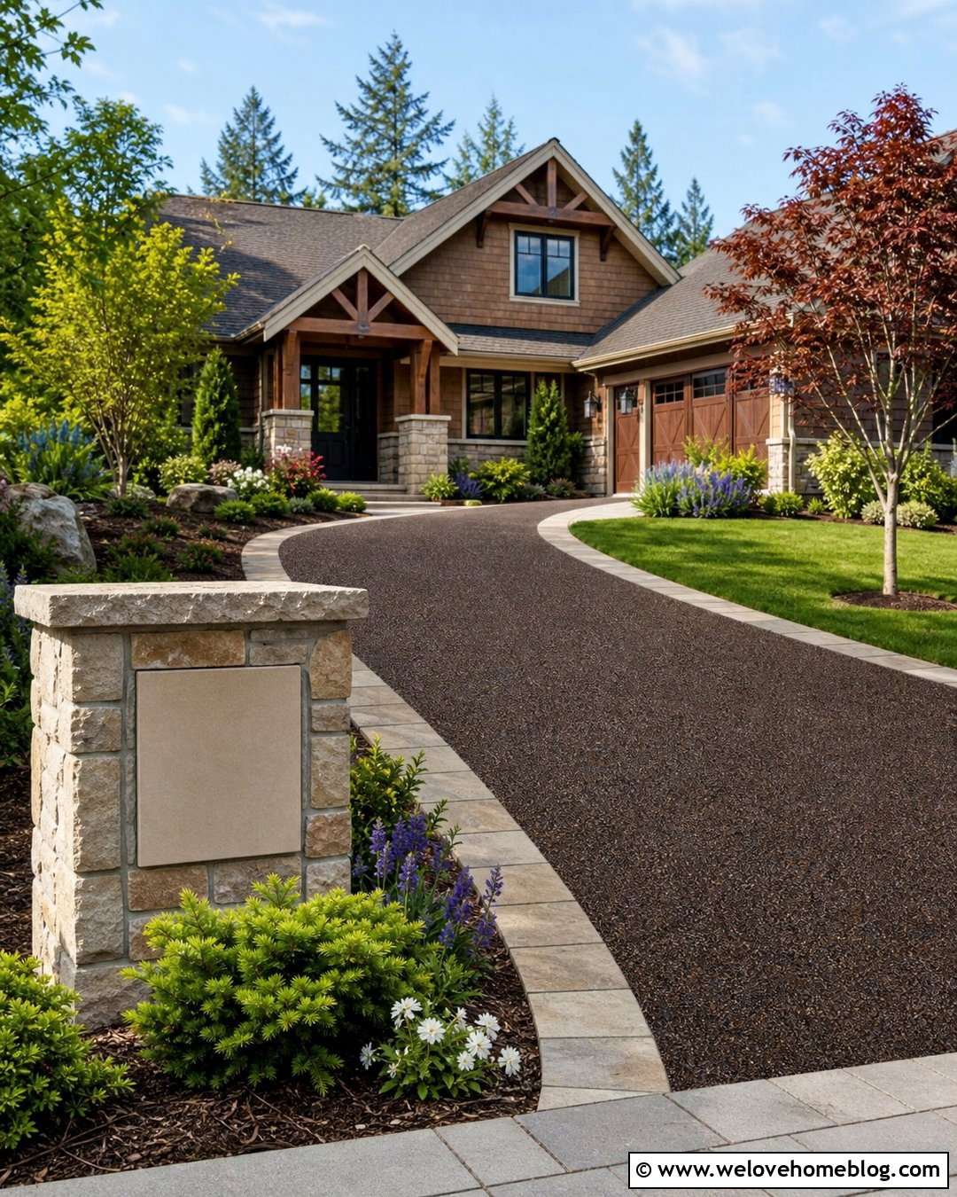
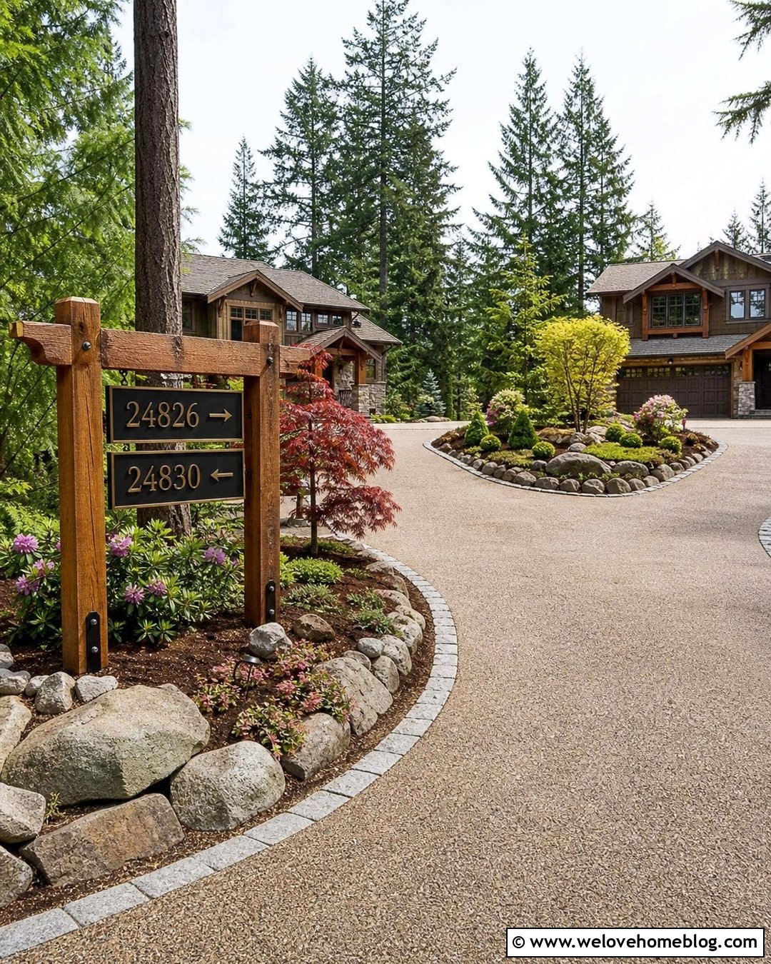
An address sign can make a driveway icon useful for navigation and property identification. Show a dark brown resin-bound gravel driveway curving from the street toward a craftsman home. Place a simple stone monument sign beside the entrance, but leave its face blank so the visual does not depend on readable text. Coordinate the sign base with a natural stone driveway border. Layer low evergreens, flowering perennials, lawn, and one small tree around the marker. In icon form, keep the sign rectangular and slightly larger than realistic scale so it remains recognizable. This complete driveway design works for map pins, rental directions, address services, entrance contractors, and community directories. The driveway curve should point from the marker toward the house, creating an intuitive visual path through the symbol.
Conclusion:
The most effective **Driveway Icon Ideas** combine a recognizable surface, clear route, and simple residential context. A driveway alone may resemble a road or walkway, so features such as a garage, house, gate, border, or address marker improve clarity. Choose materials and layouts that support the message you want to communicate. Straight concrete feels practical, curved gravel feels welcoming, and gated pavers suggest privacy. Keep small graphics simple by reducing stone patterns, plants, and architectural details. Strong outlines and controlled color contrast will help the design remain readable across websites, signs, maps, and printed materials. Whether you prefer a modern, rural, traditional, or sustainable look, the complete driveway should always remain the primary visual focus.

Related posts:


Leave a Reply