
Proportion in interior design is the art of relating objects to one another and to the space they occupy. It's about achieving harmony and balance by carefully considering the size, scale, and visual weight of every element, from furniture to accessories. When done correctly, good proportion creates a sense of comfort and visual satisfaction, making a room feel just right. This principle guides how different pieces coexist, ensuring that no single item overwhelms or feels lost within the overall scheme. Mastering proportion transforms a collection of individual items into a cohesive and aesthetically pleasing environment that is both functional and beautiful.
1. The 60-30-10 Rule for Color Proportion
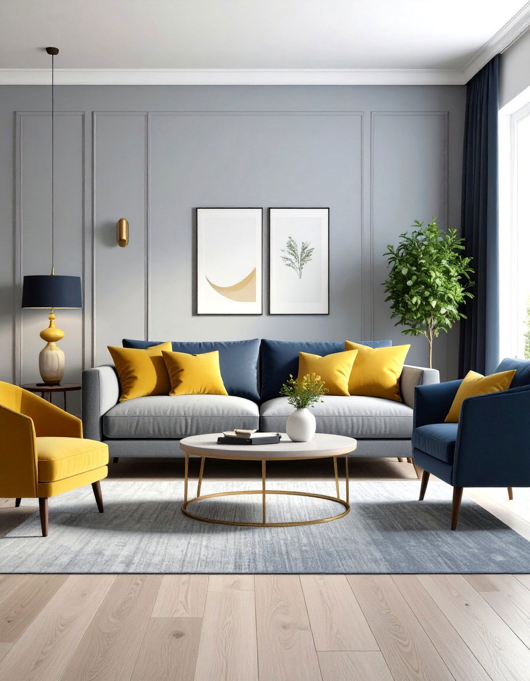
To achieve a balanced color scheme, the 60-30-10 rule provides a timeless proportion. This principle suggests that 60% of your room should be a dominant color, typically covering the walls. Thirty percent should be a secondary color, often seen in furniture, curtains, or an accent wall. The final 10% is your accent color, which adds a pop of personality through smaller items like throw pillows, decorative accessories, or artwork. This proportional distribution ensures that the colors feel harmonious and intentional rather than chaotic or randomly thrown together, creating a polished and cohesive look in any space.
2. Using the Golden Ratio for Layout Proportion
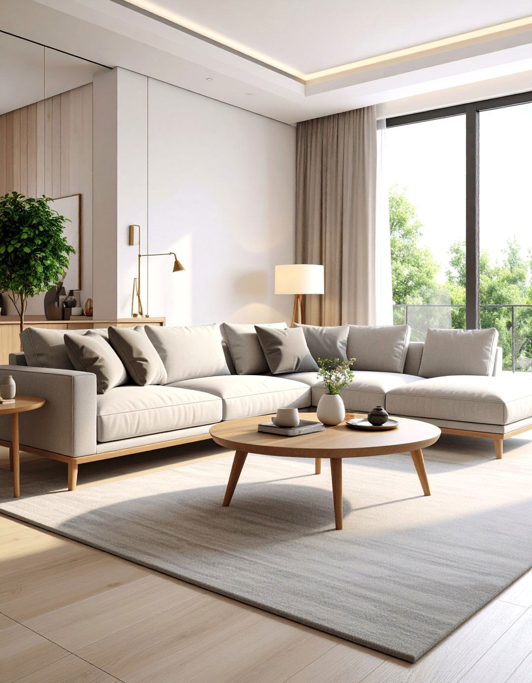
The Golden Ratio, a mathematical proportion of approximately 1.618, can be a secret weapon for creating naturally pleasing interior layouts. You can apply this by arranging furniture and decor in a way that major elements occupy roughly two-thirds of the space, a simplified application of the ratio. For instance, a coffee table should be about two-thirds the length of the sofa it accompanies. This creates a sense of subconscious balance and order. Applying this proportion to the placement of rugs, art, and even the division of wall space helps create layouts that feel inherently right and visually comfortable.
3. Achieving Proportion with an Area Rug
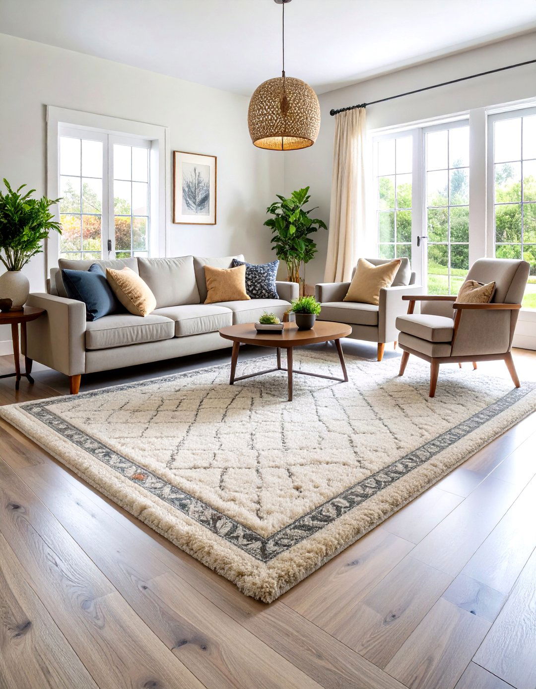
An area rug is fundamental in defining the proportion of a seating area. For a well-proportioned space, the rug should be large enough to fit at least the front legs of all major furniture pieces within its borders. A rug that is too small can make the room feel disjointed and smaller than it actually is, throwing the scale of the furniture off completely. Conversely, a correctly sized rug unifies the furniture, anchors the conversation area, and establishes a clear, proportional foundation for the entire room. This simple choice has a massive impact on the perceived harmony of the space.
4. Furniture Proportion in Relation to Room Size
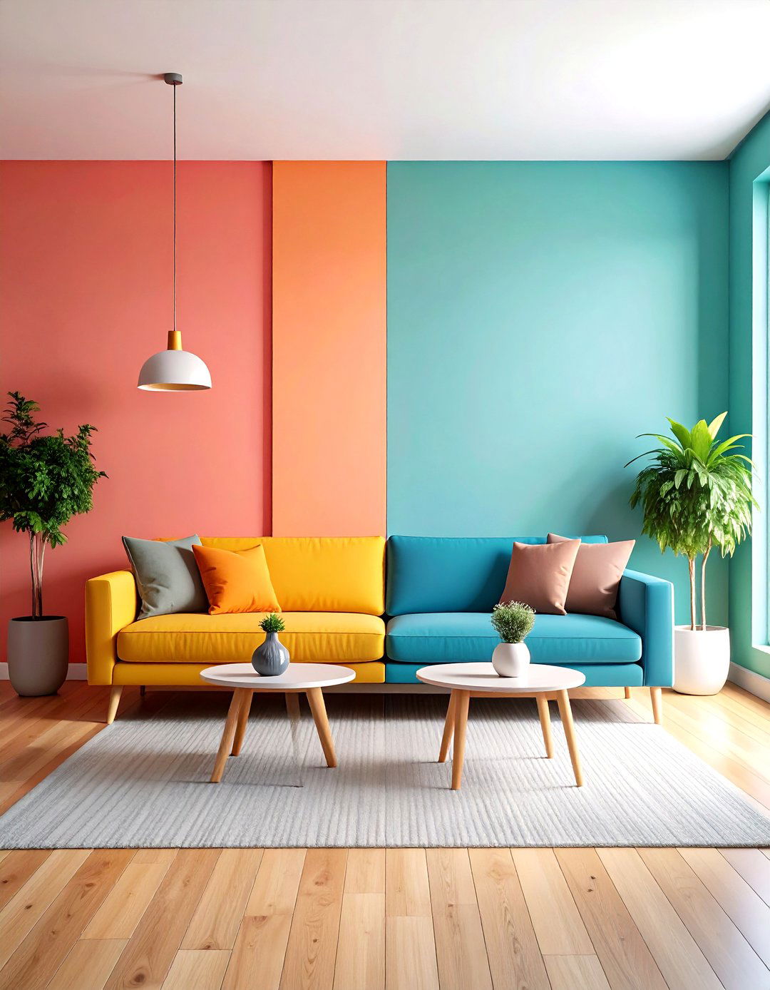
One of the most critical aspects of interior design is ensuring furniture proportion aligns with the room's overall size. In a small room, large, bulky furniture will feel overwhelming and cramped, while in a large, open-plan space, small, delicate pieces will appear lost and insignificant. The key is to select furnishings that are scaled appropriately to the volume of the room. This creates a sense of belonging and visual ease. Before buying, measure your space and create a floor plan to ensure each piece fits comfortably without dominating or disappearing, maintaining a balanced and functional layout.
5. Architectural Proportion with Ceiling Height
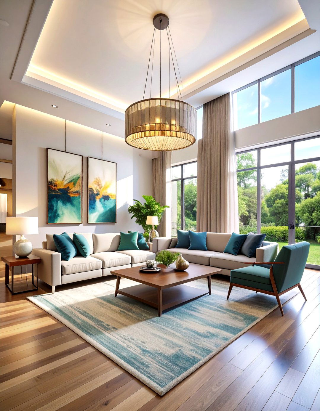
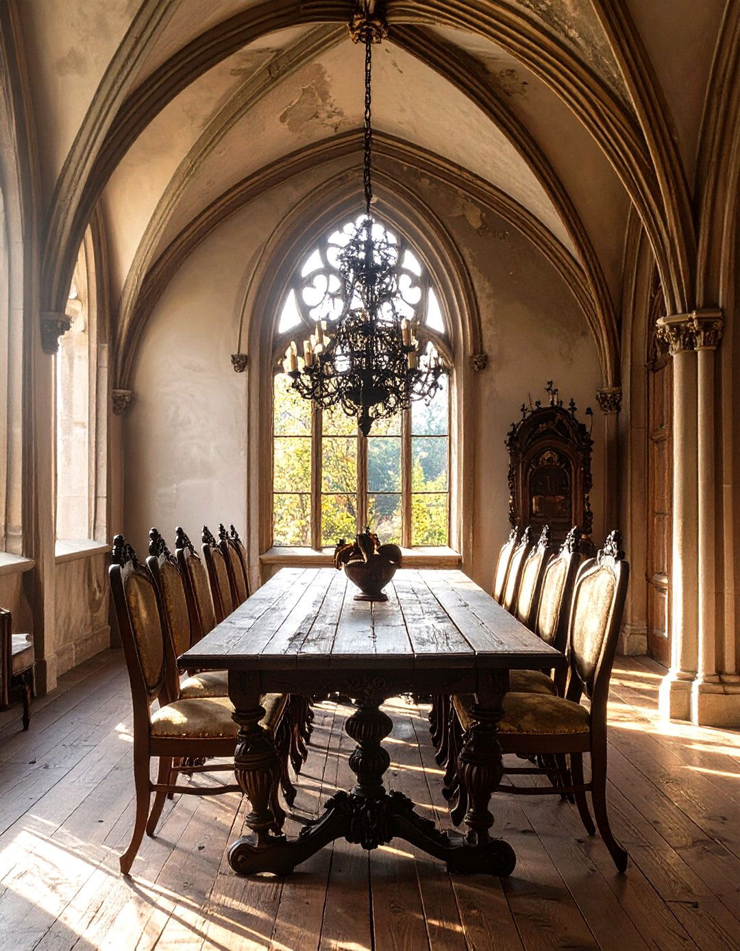
High ceilings can create a sense of grandeur, but they require careful consideration of proportion to avoid feeling cold or cavernous. To bring the scale down to a more human level, use design elements that draw the eye downward or break up the vertical space. This can be achieved with low-hanging pendant lights, artwork hung at eye level, or by painting the ceiling a darker color than the walls. For lower ceilings, create an illusion of height with vertical stripes on walls, floor-to-ceiling curtains, and low-profile furniture. This manipulation of vertical space ensures the room’s proportions feel comfortable.
6. The Proportion of Negative Space
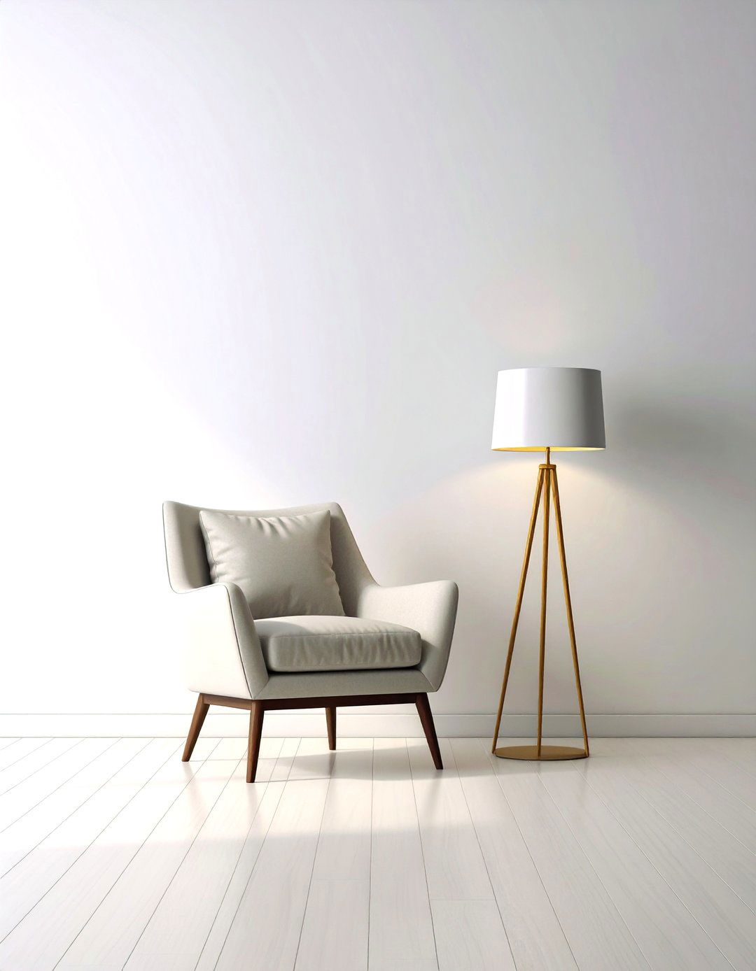
Negative space—the empty areas around and between objects—is just as important as the objects themselves for establishing good proportion. A room crammed with furniture and decor lacks breathing room, making it feel chaotic and cluttered. By intentionally leaving some areas empty, you give more visual importance to the pieces you do have. This allows each item to stand out and be appreciated. Proper use of negative space creates balance, prevents visual overload, and contributes to a calm, uncluttered atmosphere where the proportions of the room feel intentional and thoughtfully composed.
7. Light Fixture Proportion and Scale
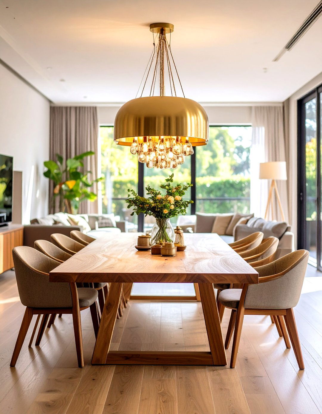
Choosing a light fixture with the correct proportion is essential for a balanced room. A pendant or chandelier that is too small will look minuscule and fail to make an impact, while one that is too large can completely overpower the space. A general guideline is to add the room’s length and width in feet, and the resulting number in inches is a good starting diameter for your fixture. For instance, a 12-by-14-foot room would call for a 26-inch diameter light. This simple calculation helps ensure your lighting serves as a complementary element rather than a proportional misstep.
8. Balancing Visual Weight for Proportion
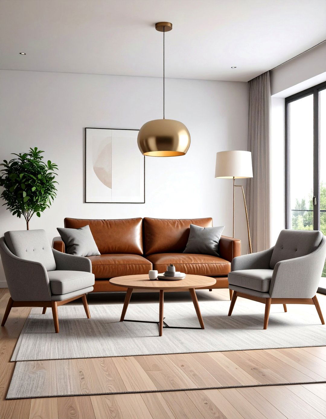
Visual weight refers to the perceived "heaviness" of an object, which is influenced by its color, texture, and size. Achieving good proportion involves balancing these visual weights throughout a room. For example, a dark, solid-wood bookshelf has more visual weight than a glass-and-metal étagère of the same size. To create harmony, you can balance a heavy piece on one side of the room with several lighter pieces on the other. This prevents one area from feeling heavier or more dominant than another, resulting in a space that feels stable, grounded, and proportionally sound.
9. Creating Proportion with Window Treatments
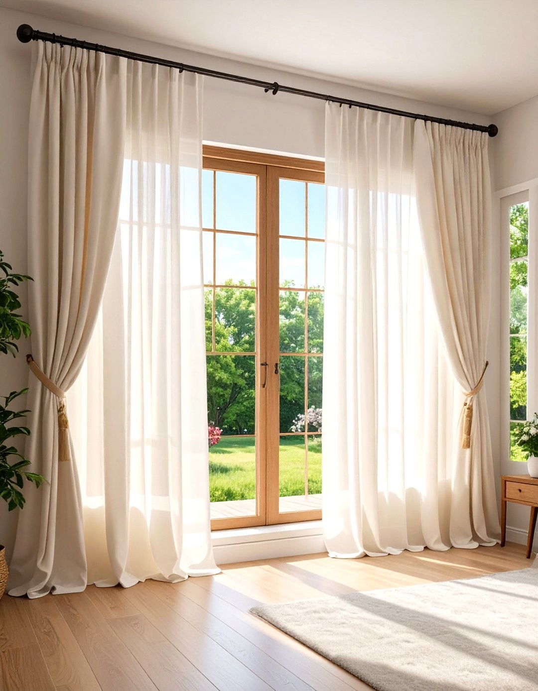
Window treatments like curtains and blinds play a significant role in a room's perceived proportions. To create an illusion of height and make a room feel grander, mount the curtain rod several inches above the window frame and extend it wider than the frame on both sides. Allowing the drapes to fall all the way to the floor further enhances this effect. This technique draws the eye upward and outward, making the window appear larger and the ceiling higher. Incorrectly hung curtains can visually shrink a window and disrupt the vertical proportion of the entire wall, so proper placement is key.

10. The Rule of Thirds in Wall Decor Proportion
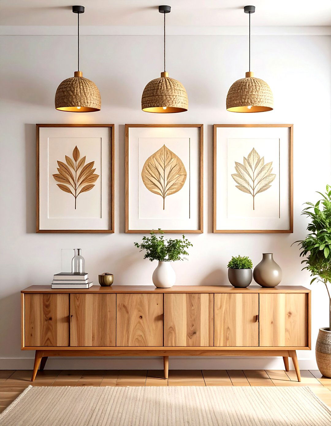
The Rule of Thirds is a powerful principle for arranging wall decor with pleasing proportions. Instead of centering a piece of art, imagine your wall is divided into a 3x3 grid. Placing key elements along these lines or at their intersections creates a more dynamic and visually interesting composition. For a gallery wall, arrange the main focal point off-center according to this rule. This asymmetrical approach feels more natural and less rigid than perfect symmetry. It guides the eye around the display, ensuring the collection of items feels balanced and thoughtfully composed rather than static.
11. Proportional Layering of Textures
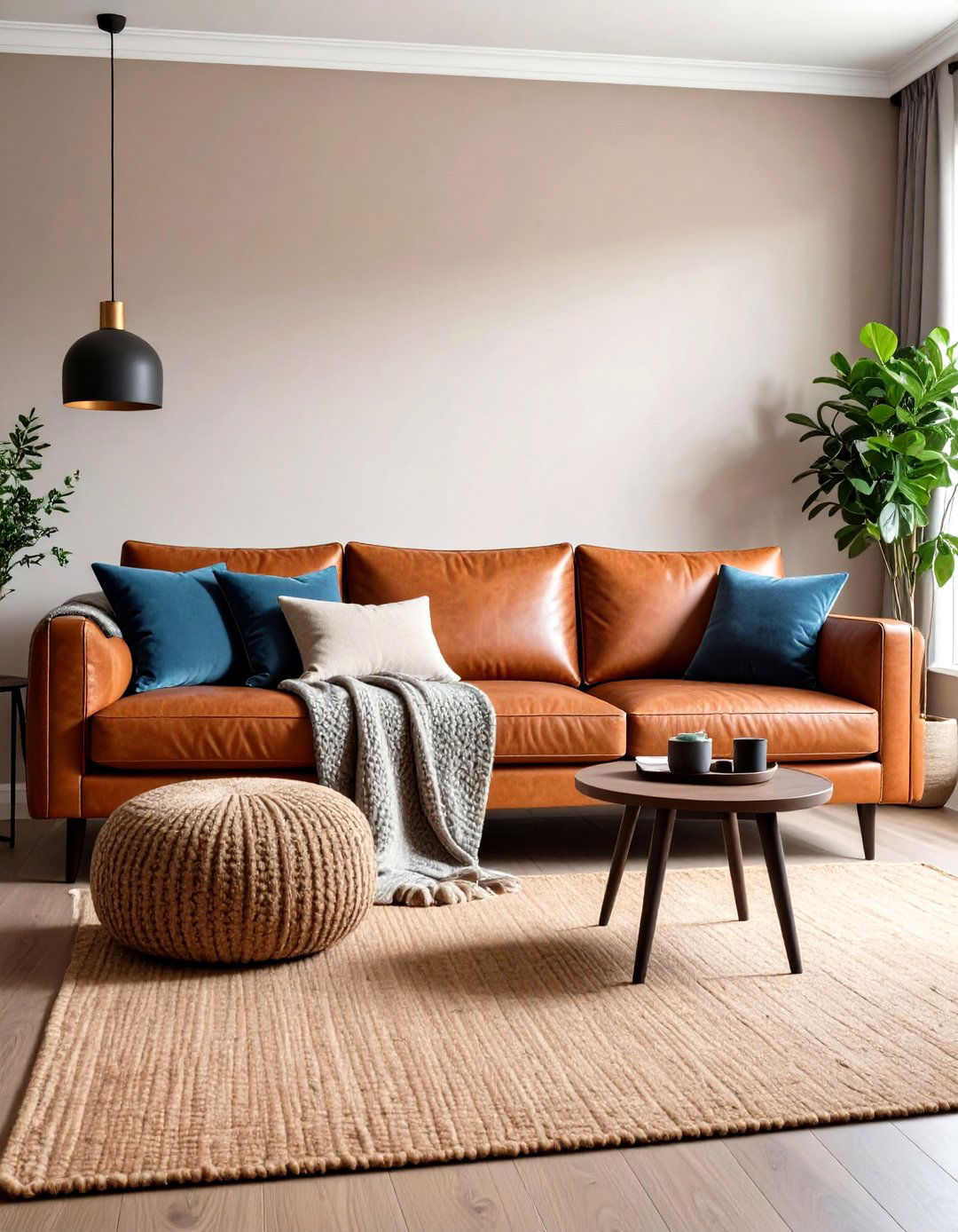
Proportion isn't just about size and scale; it also applies to the layering of textures. A well-proportioned room includes a mix of different materials and finishes distributed thoughtfully. Avoid concentrating all the heavy textures, like chunky knits and velvet, in one area. Instead, sprinkle them throughout the space to create balanced visual interest. A smooth leather sofa can be balanced with a plush rug, while sleek metal accents can be softened with linen curtains. This proportional distribution ensures the room feels rich and layered without any single texture overwhelming the senses, adding depth and sophistication.
12. Sofa and Coffee Table Proportion
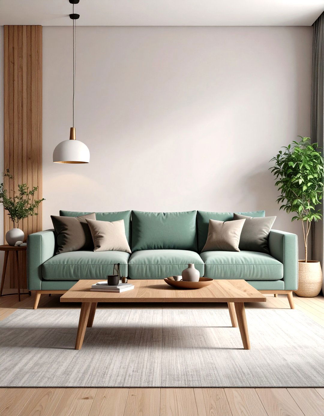
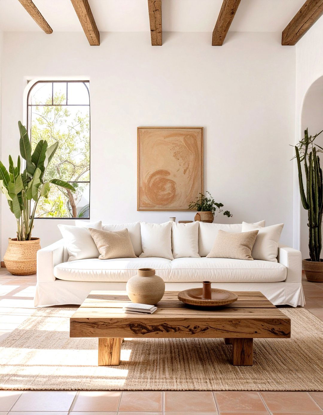
The relationship between a sofa and its coffee table is a classic example of proportion in action. A common mistake is choosing a coffee table that is too small or too large for the sofa. For ideal proportion, the coffee table should be approximately one-half to two-thirds the length of the sofa. In terms of height, it should be the same height as the sofa cushions or slightly lower, allowing for comfortable use. This creates a cohesive and functional pairing that looks intentional. An ill-proportioned coffee table can disrupt the entire flow of a living room’s main seating area.
13. Balancing Proportions in an Open-Concept Space
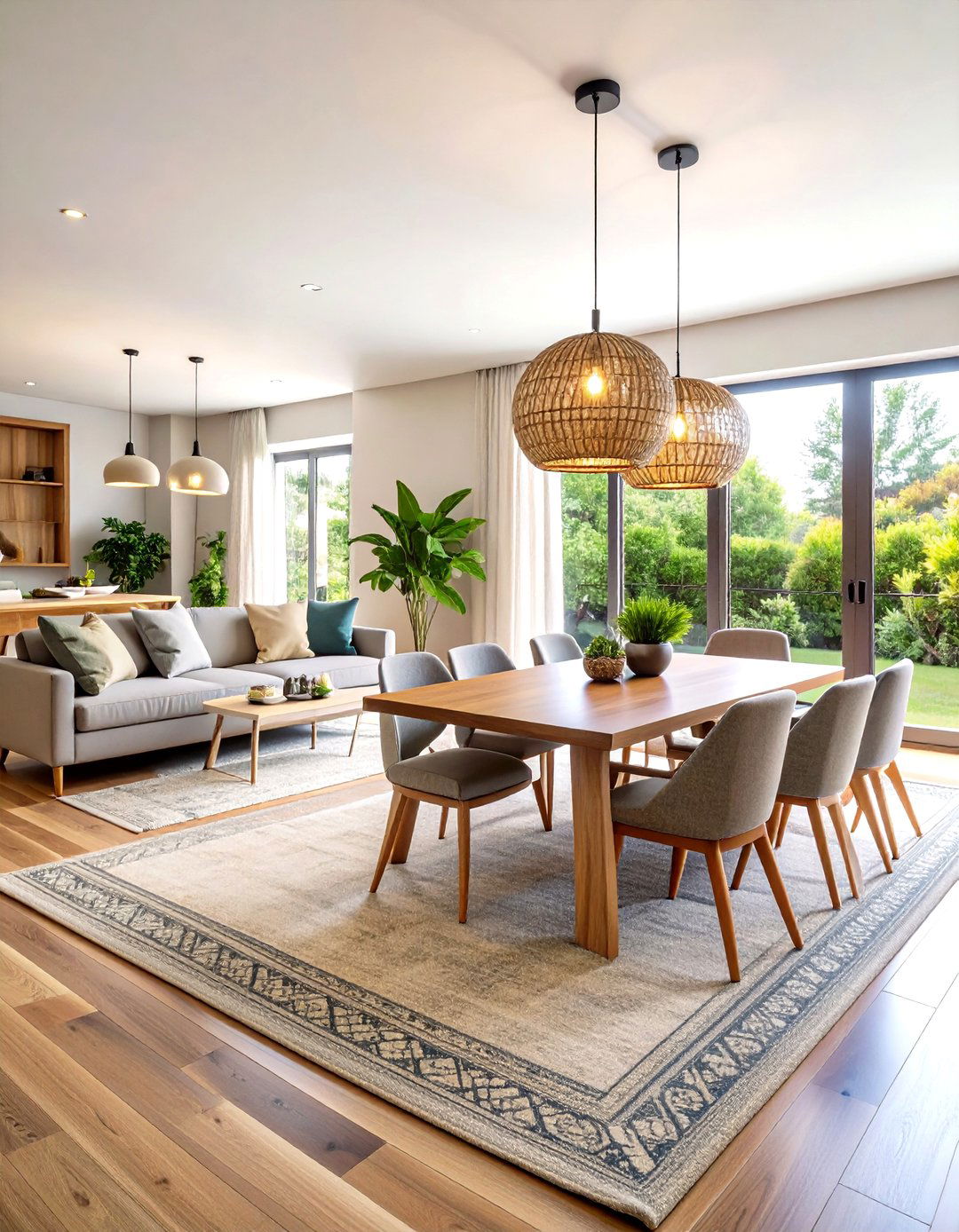
In an open-concept layout, defining distinct "zones" with proper proportion is crucial to avoid a cavernous, undefined feeling. Use large area rugs to anchor different areas like the living and dining spaces. Arrange furniture into functional groups to create visual separation. For example, a sofa with a console table behind it can act as a subtle divider. Consistent use of a color palette or materials across the zones can unify the space, while ensuring the furniture in each zone is scaled appropriately to its function. This creates a harmonious flow where each area feels both distinct and part of a larger whole.
14. Using Mirrors to Alter Room Proportion
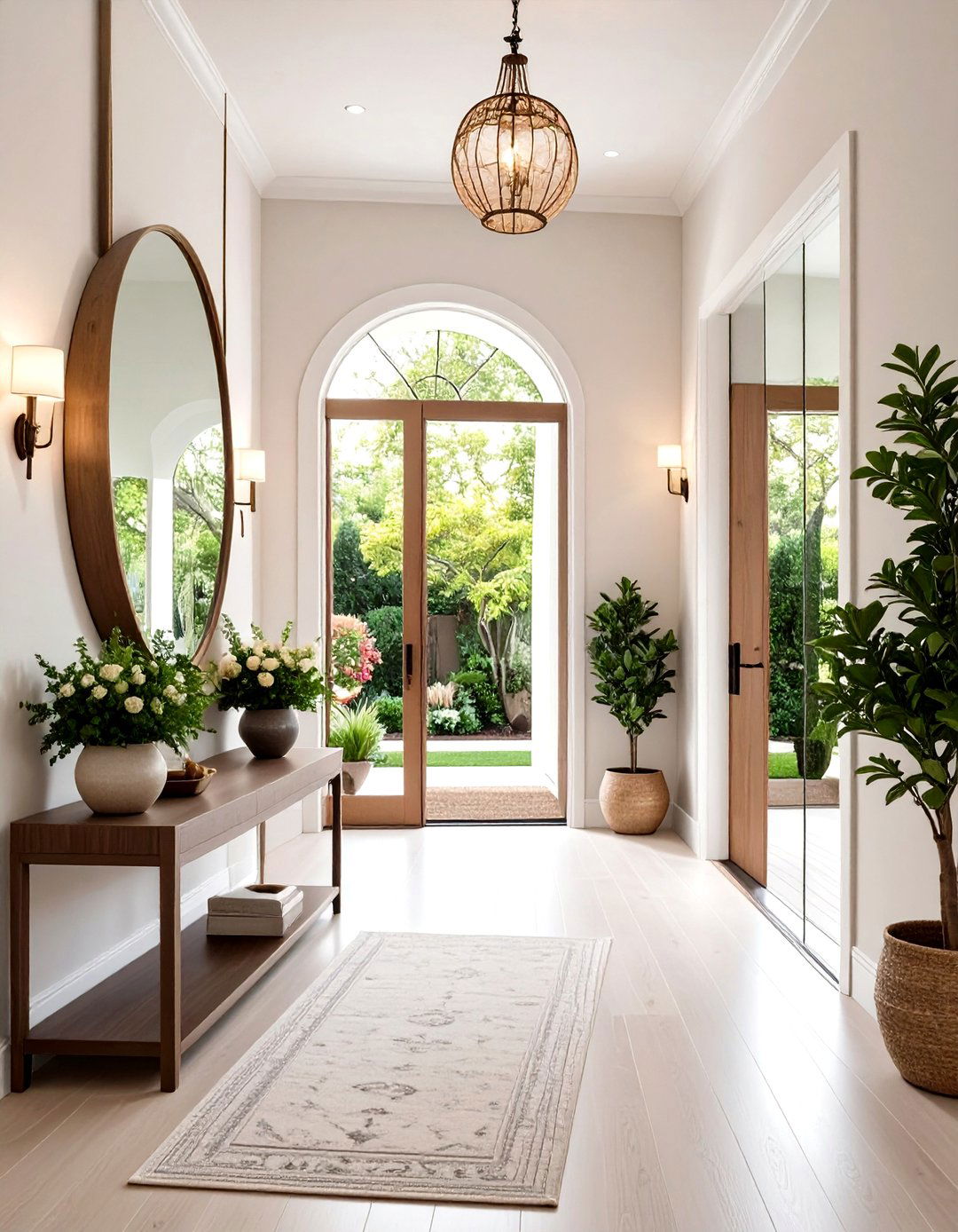
Mirrors are a designer’s tool for manipulating the perception of proportion in a room. Placing a large mirror on a wall can create an illusion of depth, making a small room feel significantly larger and more open. It reflects light and the view, effectively doubling the visual space. If you have a narrow hallway, a long runner mirror can make it feel wider. The key is scale; a small mirror won't have the same space-altering effect. By choosing a mirror with a substantial presence, you can strategically alter the room's perceived dimensions for a more balanced feel.

15. The Proportion of a Bed to its Headboard
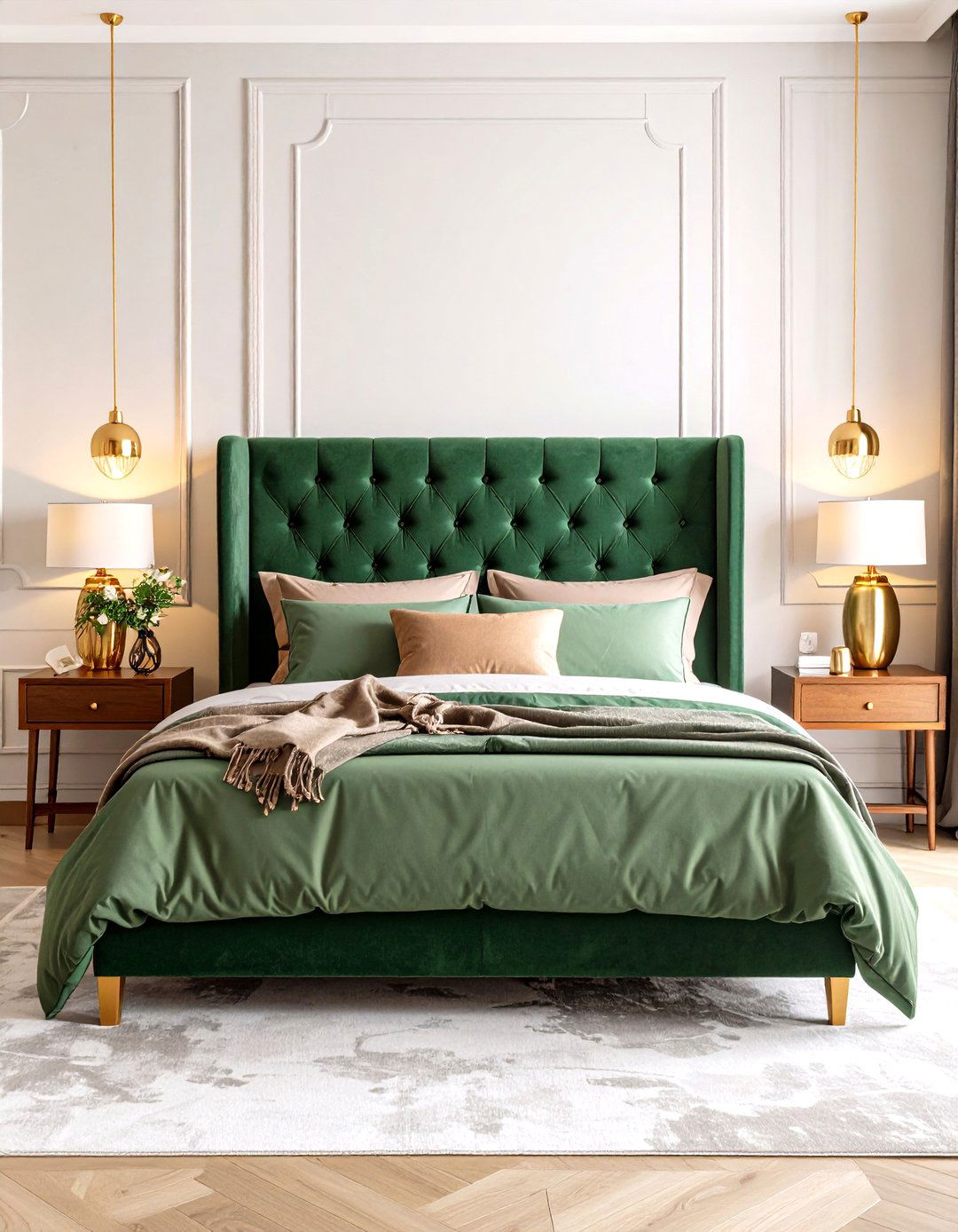
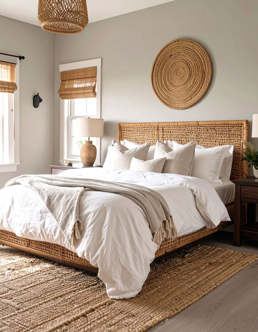
The proportion between a bed and its headboard sets the tone for the entire bedroom. An overly large, dramatic headboard can serve as a stunning focal point, but it must be balanced by the size of the room and the height of the ceiling. In contrast, a headboard that is too small or narrow for the mattress can look awkward and unfinished. A well-proportioned headboard should be slightly wider than the mattress on each side. This frames the bed perfectly, creating a sense of completeness and providing a strong anchor for the room’s most important piece of furniture.
16. Nightstand and Bed Proportion
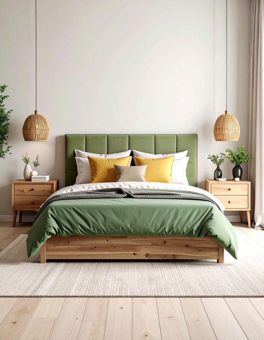
For a bedroom to feel harmonious, the nightstands must be in proportion to the bed. A common rule of thumb is that the top of the nightstand should be level with the top of the mattress, or up to a few inches taller. This makes it easy to reach for a glass of water or turn off a lamp from bed. In terms of width, the nightstand should be scaled to the size of the bed and the available space. A tiny nightstand next to a California king bed will look lost, while a bulky one will overwhelm a twin bed and the room.
17. Proportion in Bookshelf and Shelf Styling
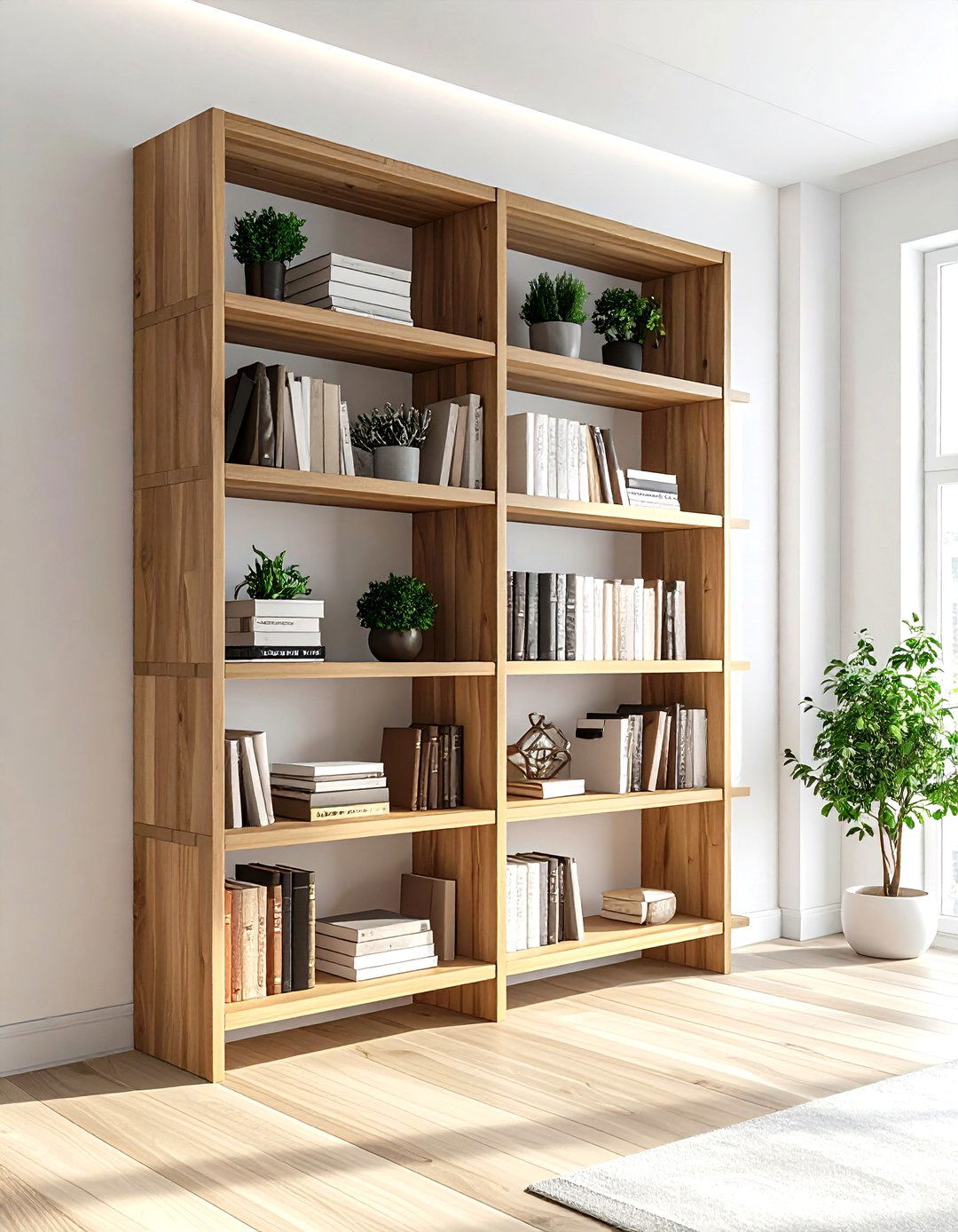
Styling a bookshelf is a masterclass in small-scale proportion. To avoid a cluttered or chaotic look, vary the size, shape, and orientation of objects. Mix vertical stacks of books with horizontal ones. Use the rule of odds by grouping decorative objects in threes or fives. Leave some empty space (negative space) on each shelf to allow items to breathe. Balance larger items on one shelf with a collection of smaller items on another. This thoughtful arrangement creates a dynamic visual rhythm and ensures the entire unit feels balanced and artistically composed.
18. Kitchen Island Proportion
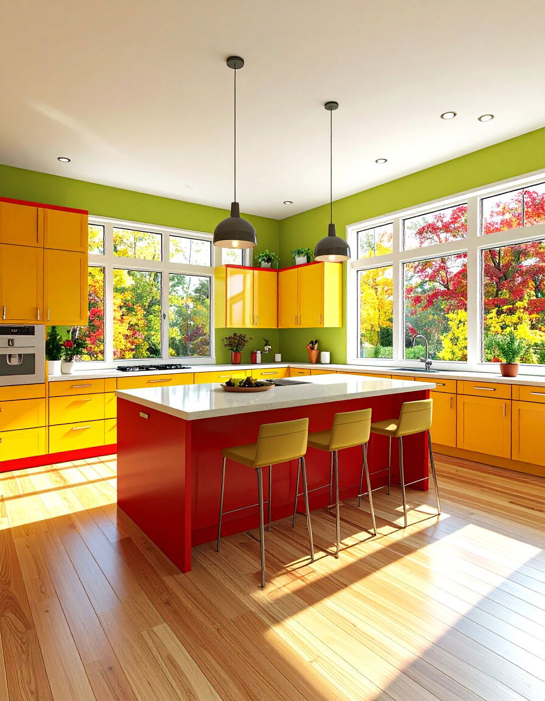
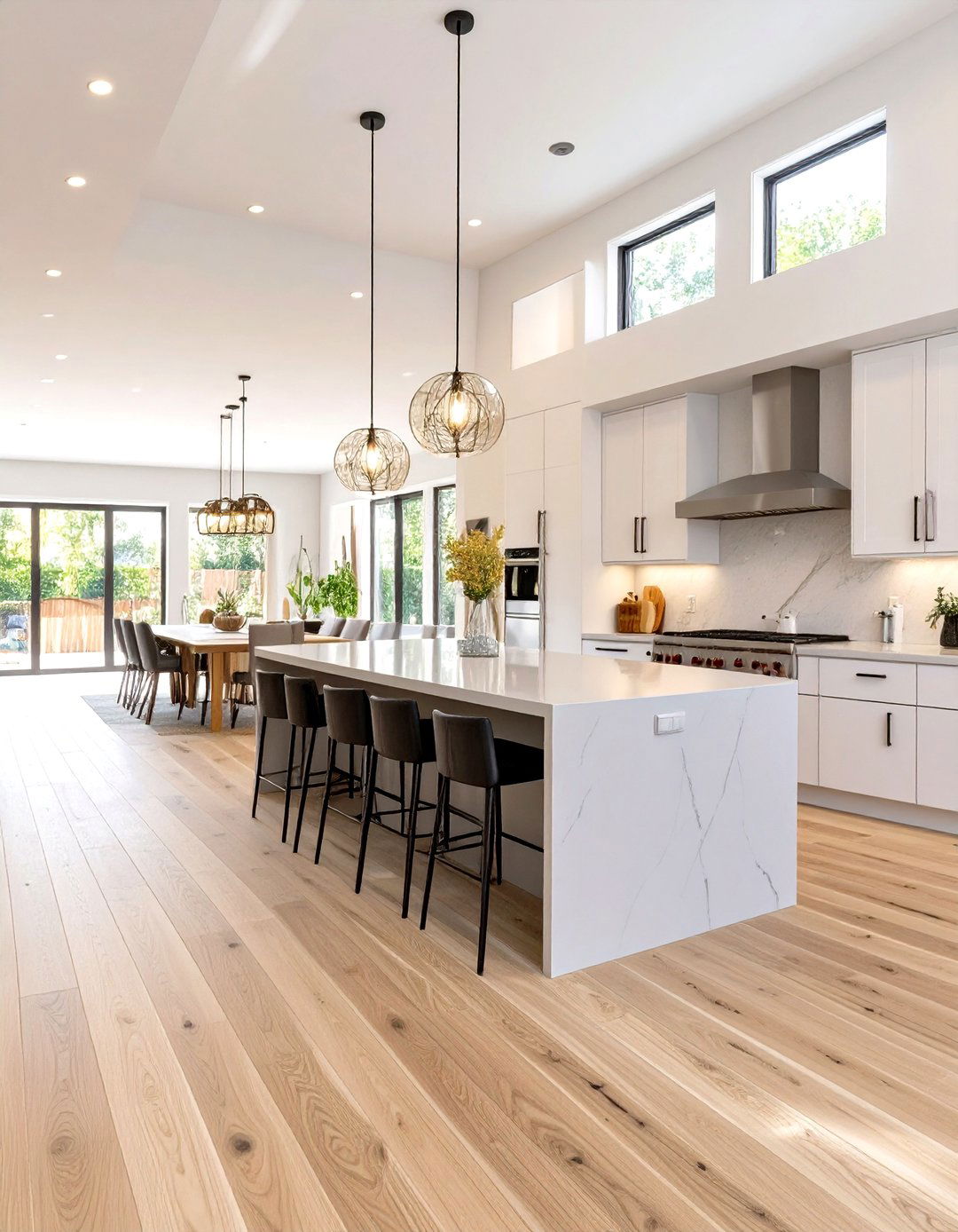
A kitchen island must be carefully proportioned to ensure it is functional and not an obstacle. It needs to be large enough to be useful but not so large that it hinders workflow and movement. A key guideline is to maintain at least 36 to 42 inches of clear walkway space on all sides of the island. Its length and width should also be in scale with the overall kitchen dimensions. A massive island in a small kitchen creates a cramped environment, while a tiny island in a vast kitchen looks purposeless. Proper proportion here is essential for both aesthetics and usability.
19. Dining Table and Chair Proportion
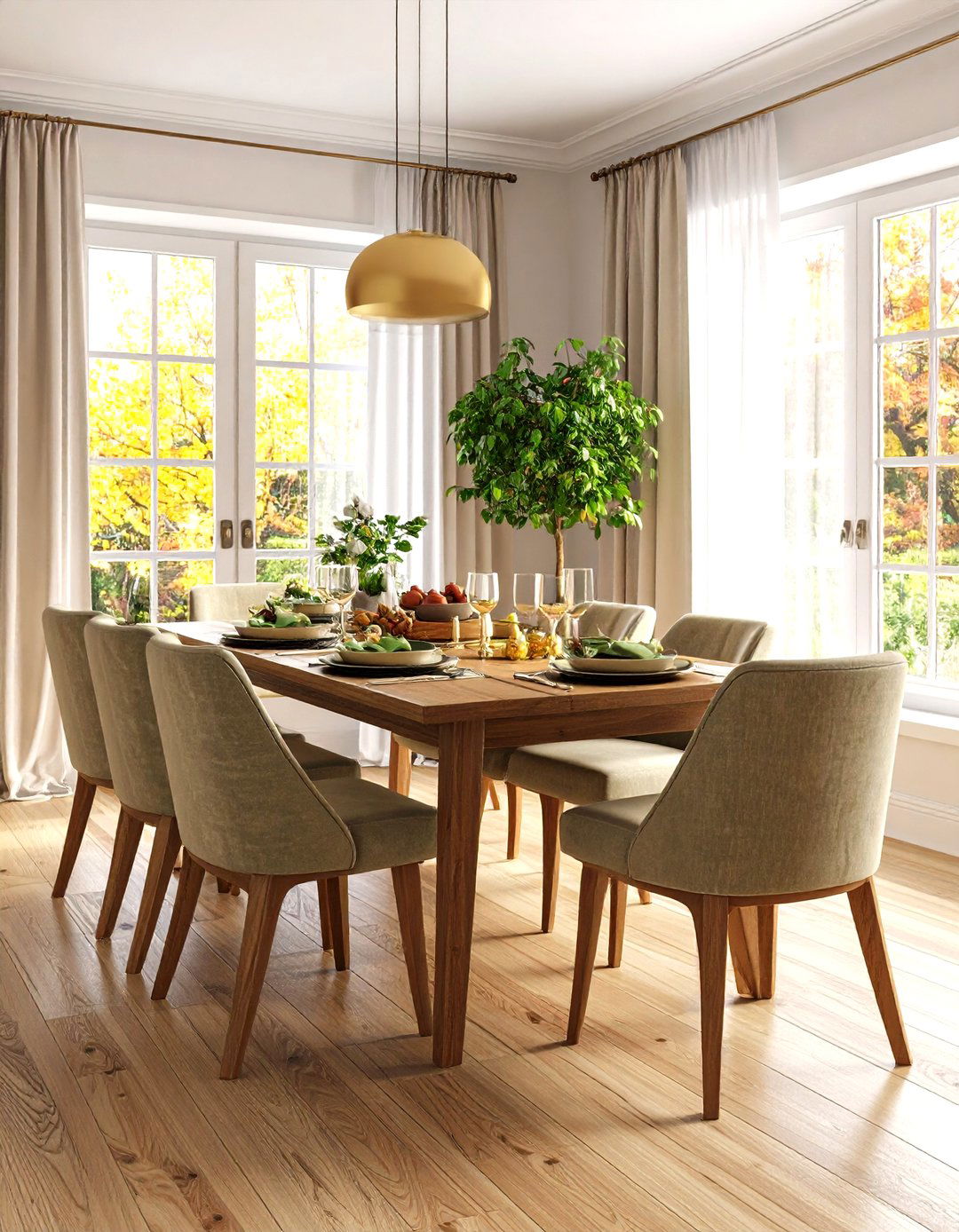
The proportion between a dining table and its chairs is crucial for both comfort and visual harmony. The chairs should be scaled to fit the table, with enough room to slide in and out easily without feeling cramped. A standard rule is to allow about 24 inches of table length per chair to ensure adequate elbow room. The height is also critical; there should be approximately 10 to 12 inches of space between the seat of the chair and the bottom of the tabletop to provide comfortable legroom. This ensures the set looks and functions as a cohesive, well-proportioned unit.
20. Achieving Proportion with Pattern
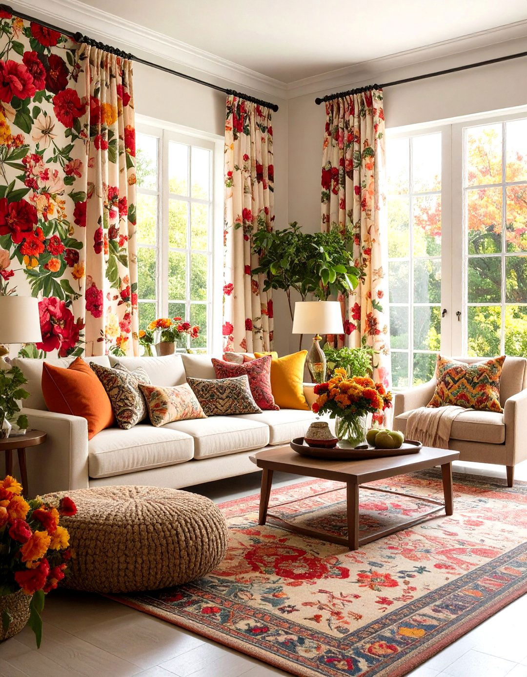
When using patterns in a room, varying their scale is key to achieving a sense of proportion. The "three-pattern rule" suggests using three different patterns in a space: one large-scale, one medium-scale, and one small-scale. For example, you might have a large-scale pattern on an area rug, a medium-scale one on curtains, and a small-scale print on throw pillows. This creates a layered, sophisticated look without being overwhelming. All patterns should share a common color palette to tie them together, ensuring the mix feels intentional and proportionally balanced.
21. Plant and Pot Proportion
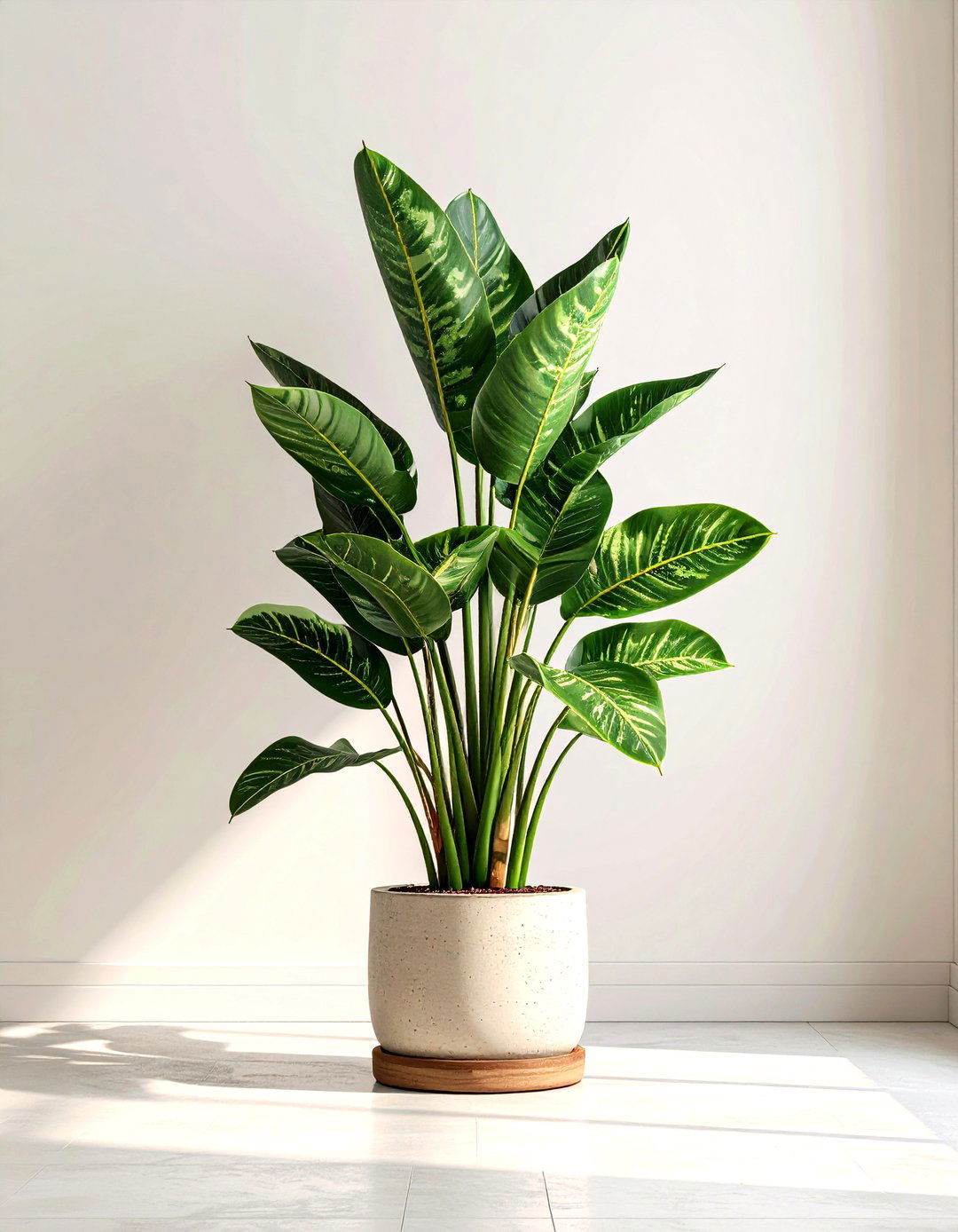
Incorporating plants into your decor requires attention to the proportion between the plant and its pot. A large, dramatic plant like a fiddle leaf fig will look silly in a tiny pot, and a small succulent would be lost in an oversized planter. The pot should be large enough to accommodate the plant's root ball with a little room to grow, but not so large that it looks top-heavy or out of scale. Typically, the diameter of the pot should be about one-third of the plant's height for a balanced, aesthetically pleasing look that supports the plant's health and visual appeal.
22. TV and Console Proportion
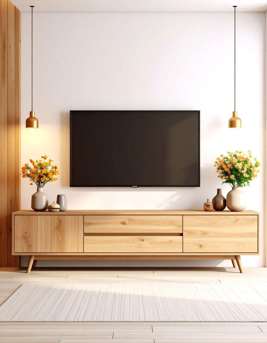
When placing a television, its proportion relative to the media console below it is important for a clean, balanced look. The console should always be wider than the television itself—ideally by at least a few inches on each side. A TV that is wider than its stand looks top-heavy and precarious, creating a sense of visual instability. This simple rule of proportion ensures the two pieces feel like a unified whole. It provides a solid visual base for the screen and also offers practical surface space for speakers or decorative items without looking crowded.
23. Proportion of Lampshade to Lamp Base
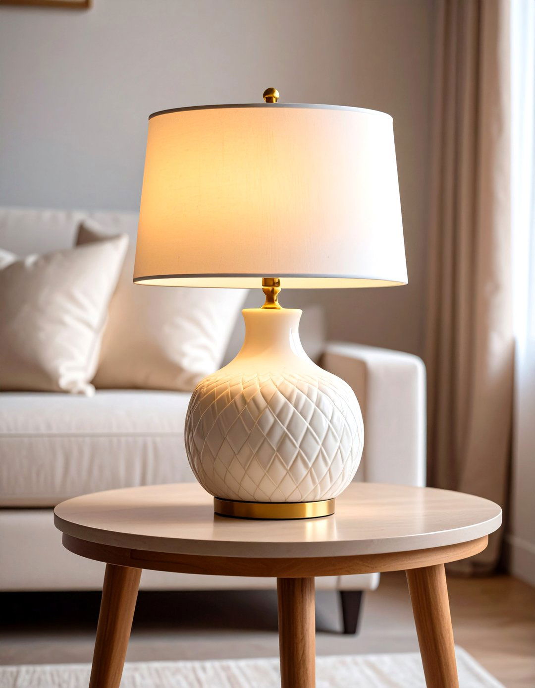
Achieving the right proportion between a lampshade and its base is essential for a table lamp to look correct. A good guideline is that the height of the shade should be about two-thirds the height of the base. The widest part of the lampshade should be at least a half-inch wider than the widest part of the base on each side. This prevents the lamp from looking top-heavy or bottom-heavy. A shade that is too large can overwhelm the base, while one that is too small can look comically inadequate, disrupting the delicate balance of the piece.
24. Fireplace and Mantel Proportion
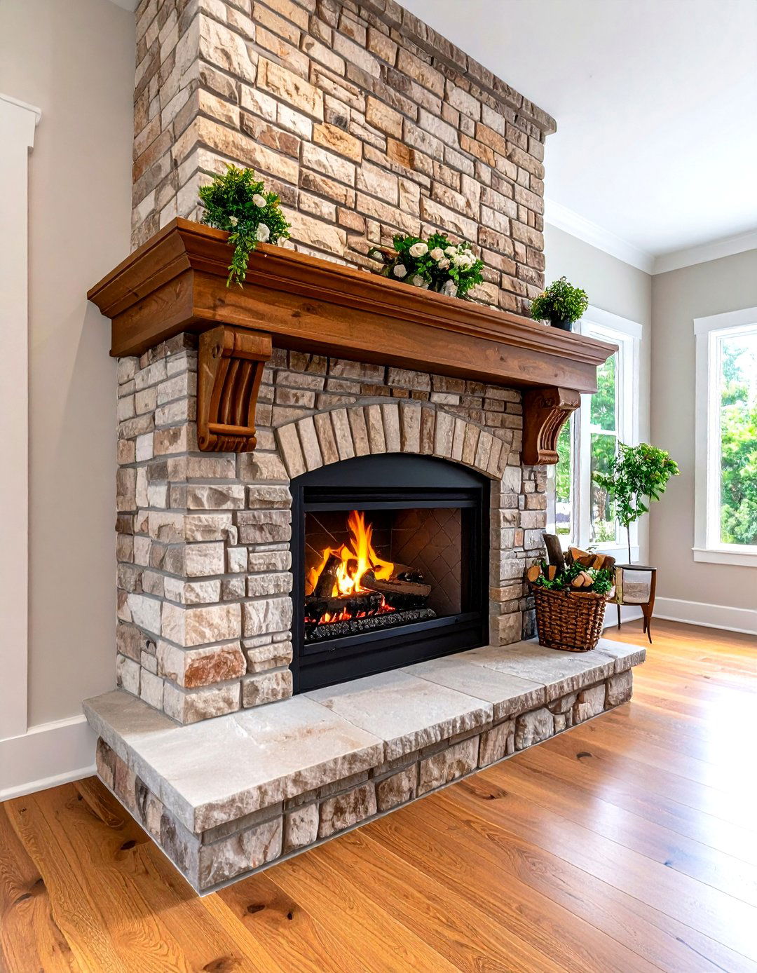
The fireplace is often the focal point of a room, and its mantel's proportion is key to its success. The mantel should feel substantial enough to balance the visual weight of the firebox below. A general rule suggests the mantel width should extend at least 3 inches beyond the fireplace surround on each side, and often more for a grander look. Its depth must be practical for displaying objects but not so deep that it juts out awkwardly. The height is also crucial, as it dictates the scale for any art or mirrors placed above it, anchoring the entire wall composition.
25. Entryway Console Table Proportion
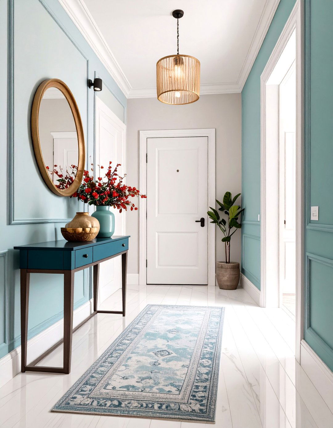
In an entryway, a console table must be proportioned to the space to be both welcoming and functional. In a narrow hallway, a slim, shallow console table is essential to allow for easy passage without creating a bottleneck. In a larger, more open foyer, a more substantial table can be used to anchor the space and make a statement. Its length should be in scale with the wall it sits against, avoiding looking too small or overwhelmingly large. This first impression piece sets the proportional tone for the rest of the home, so getting it right is important.
26. Using Proportion in Asymmetrical Balance
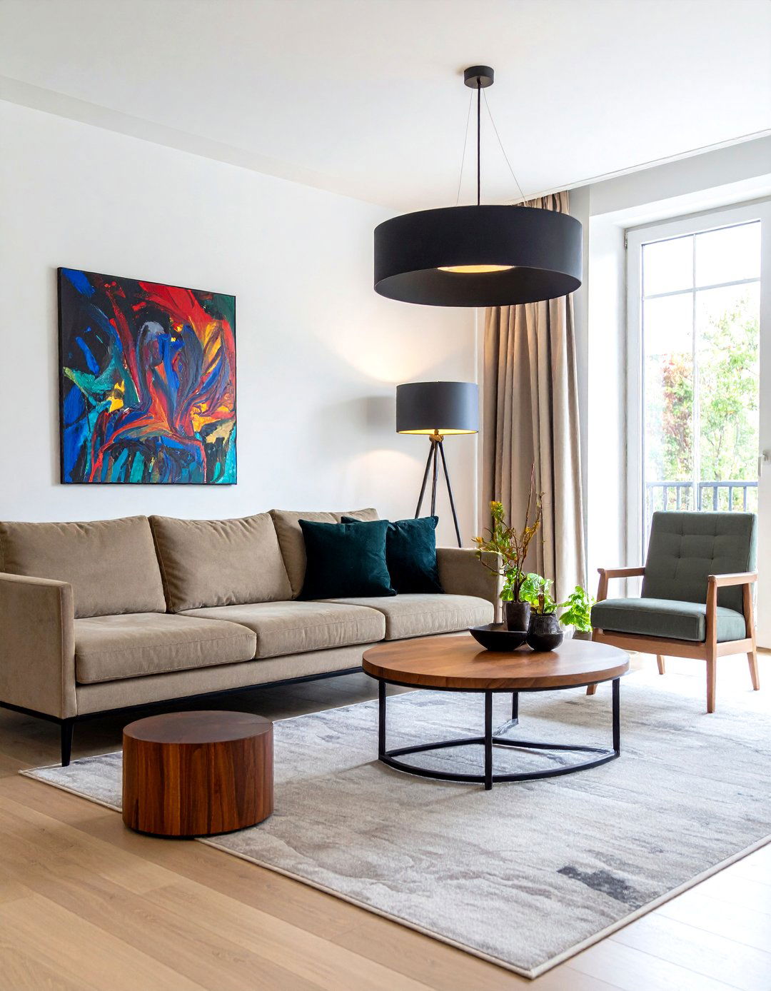
Proportion is key to achieving asymmetrical balance, which creates a more dynamic and modern feel than perfect symmetry. This involves arranging objects of dissimilar visual weight to achieve equilibrium. For instance, you could balance a large sofa on one side of a room with two smaller armchairs and a floor lamp on the opposite side. While the objects are different, their visual weights are distributed to create a sense of overall balance. This approach relies on an intuitive understanding of proportion, resulting in a space that feels carefully curated yet effortlessly stylish.
27. Art and Furniture Proportional Relationship
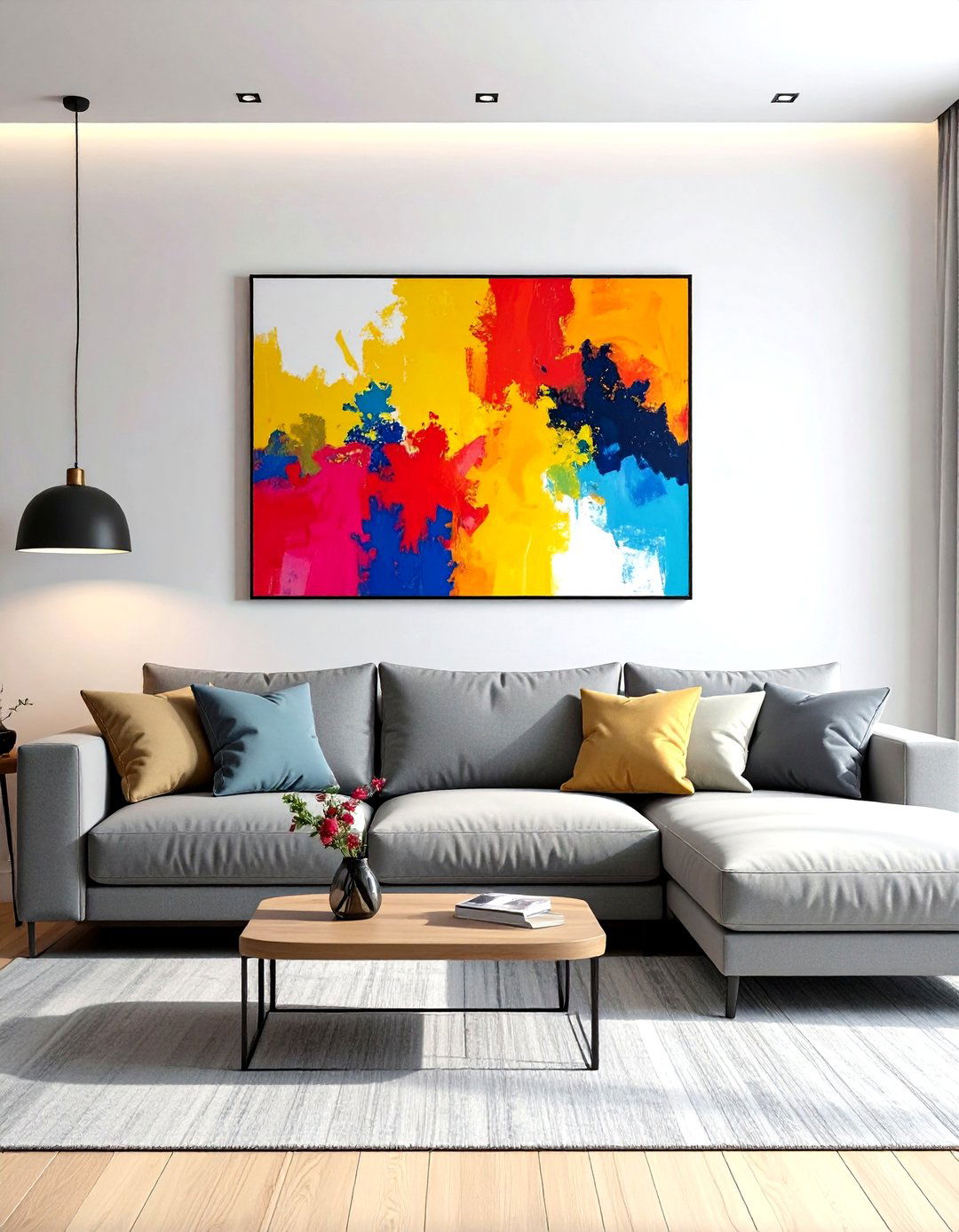
The proportional relationship between artwork and the furniture it hangs above is critical. Art hung over a sofa, headboard, or console table should be approximately two-thirds the width of the furniture piece. This creates a strong visual connection between the two elements, making them feel like a cohesive vignette. An artwork that is too small will look lost, while one that is too wide will overpower the furniture beneath it. This simple guideline ensures that your art complements the furniture, creating a balanced and intentional focal point within the room's design scheme.
28. Proportional Grouping of Accessories
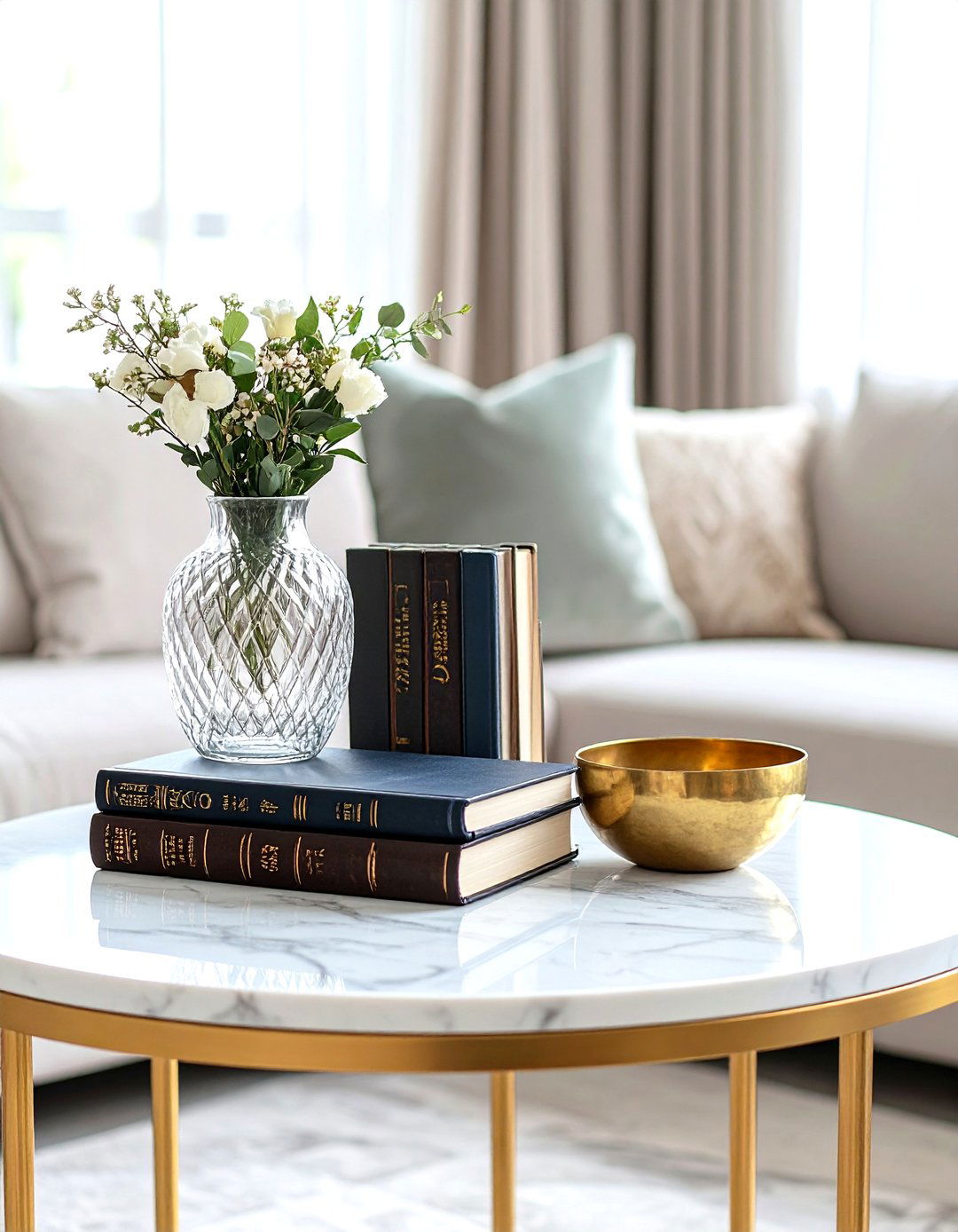
When decorating surfaces like coffee tables or shelves, grouping accessories in a way that respects proportion is key. Create visual interest by clustering items of varying heights, shapes, and textures. The rule of odds is effective here; groupings of three or five objects tend to be more visually appealing than even-numbered groups. For instance, on a coffee table, you might pair a tall vase with a medium-sized stack of books and a small decorative bowl. This creates a balanced, multi-level composition where each object has a proportional relationship to the others in the group.
29. Bathroom Vanity and Mirror Proportion
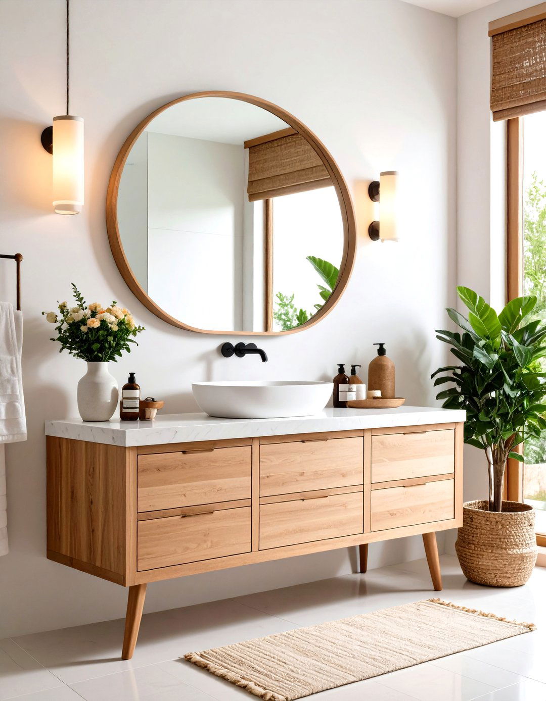
In a bathroom, the proportion of the vanity mirror to the vanity itself defines the space. The mirror should typically not be wider than the vanity cabinet it hangs above. For a clean, modern look, a mirror that is the exact same width as the vanity can create a seamless, integrated feel. If you are using sconces on either side, factor them into the total width to ensure the entire composition feels balanced on the wall. A mirror that is too small can look cheap and unconsidered, while one that is too large can overwhelm the room’s intimate scale.
30. Using Vertical Lines to Adjust Proportion
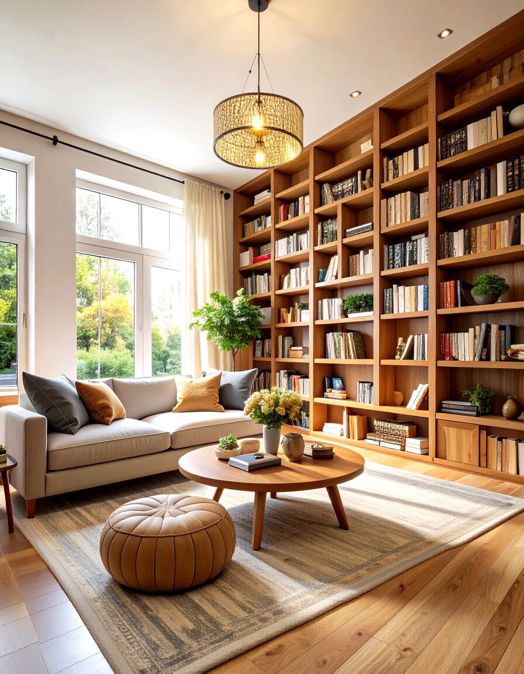
You can skillfully manipulate a room's perceived proportions using vertical lines. In a room with a low ceiling, introducing vertical elements can draw the eye upward, creating an illusion of height. This can be achieved with floor-to-ceiling curtains, tall, narrow bookshelves, vertically striped wallpaper, or a tall, slender floor lamp. These elements break up the horizontal plane and give the space a sense of lift and airiness. This technique is a powerful tool for correcting architectural imbalances and making a space feel more open and gracefully proportioned than it actually is.
Conclusion:
Ultimately, proportion in interior design is about creating relationships between objects and space to foster a sense of harmony. From the 60-30-10 color rule to the scale of a rug, each decision contributes to a cohesive whole. By understanding and applying principles like the Golden Ratio, visual weight, and negative space, you can craft environments that feel balanced, comfortable, and visually satisfying. Good proportion ensures that every element, whether large or small, has its perfect place, resulting in spaces that are not just decorated, but thoughtfully and beautifully designed.

Related posts:



Leave a Reply